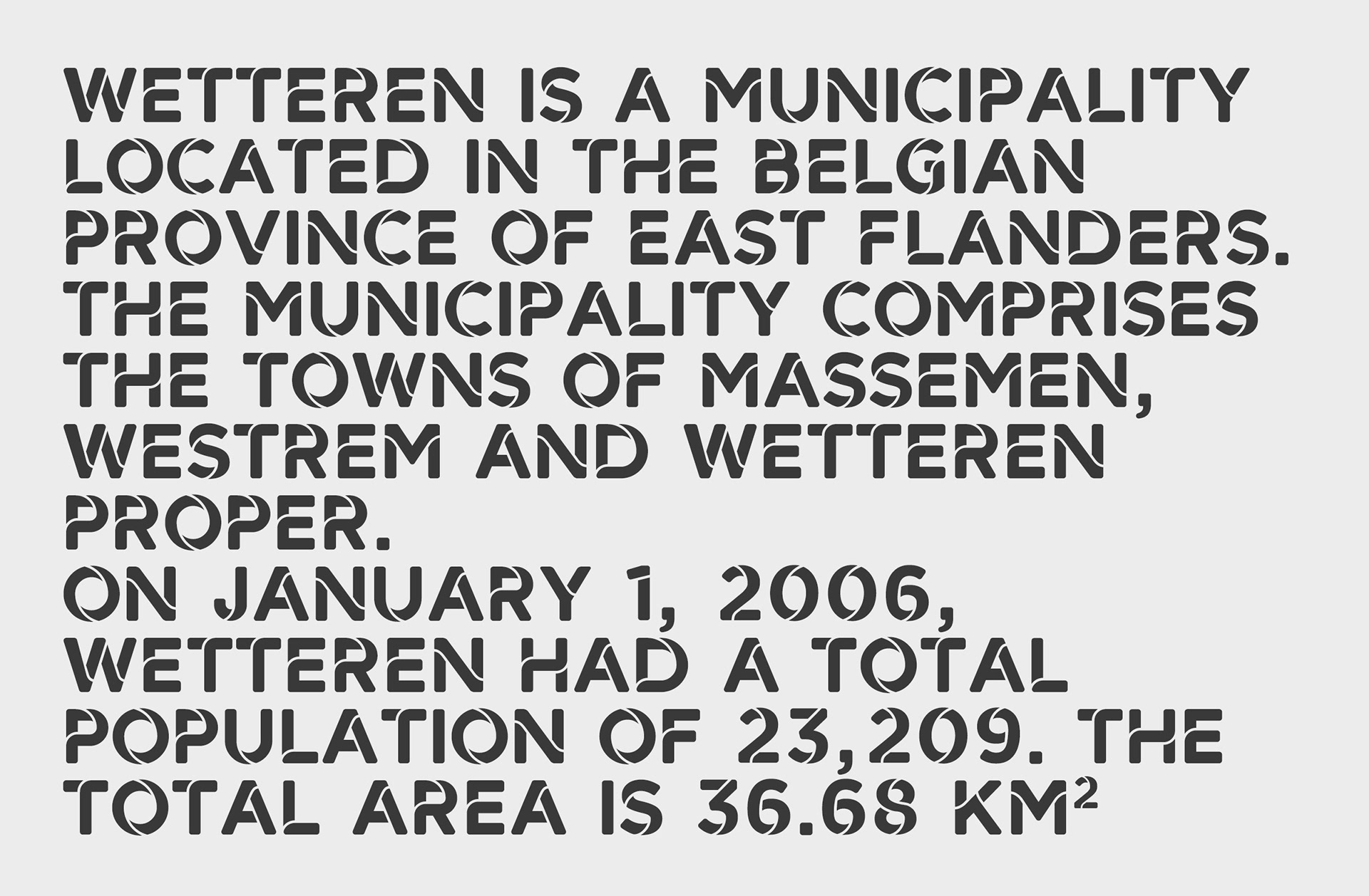
Wetteren is a city located in the Belgian province of East Flanders. In the past years, the city has invested a lot in infrastructure and is constantly changing and renewing itself.
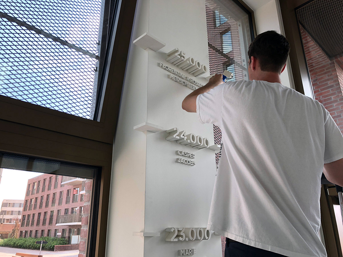
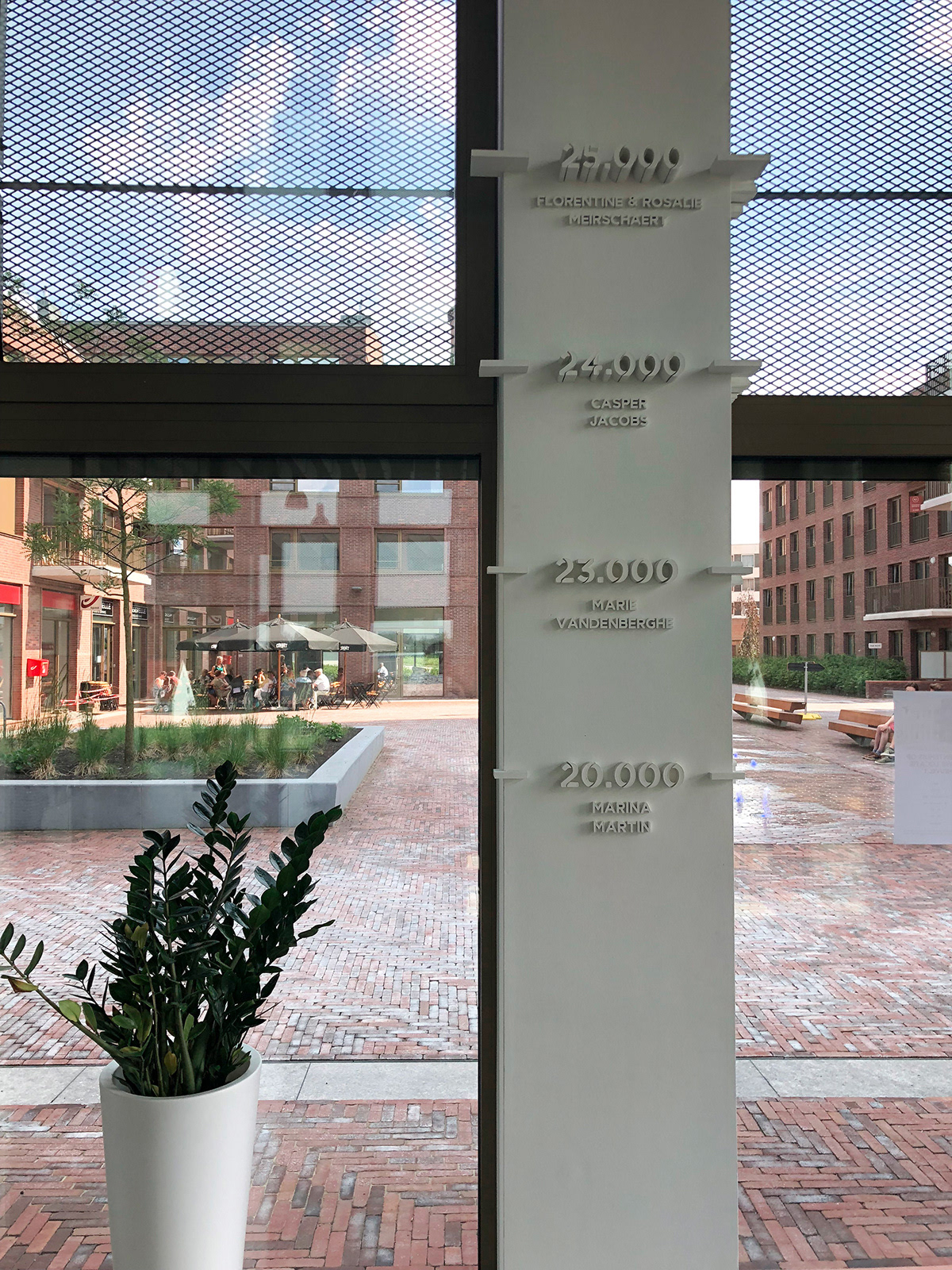
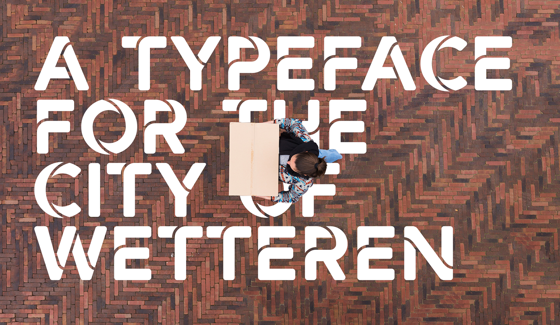
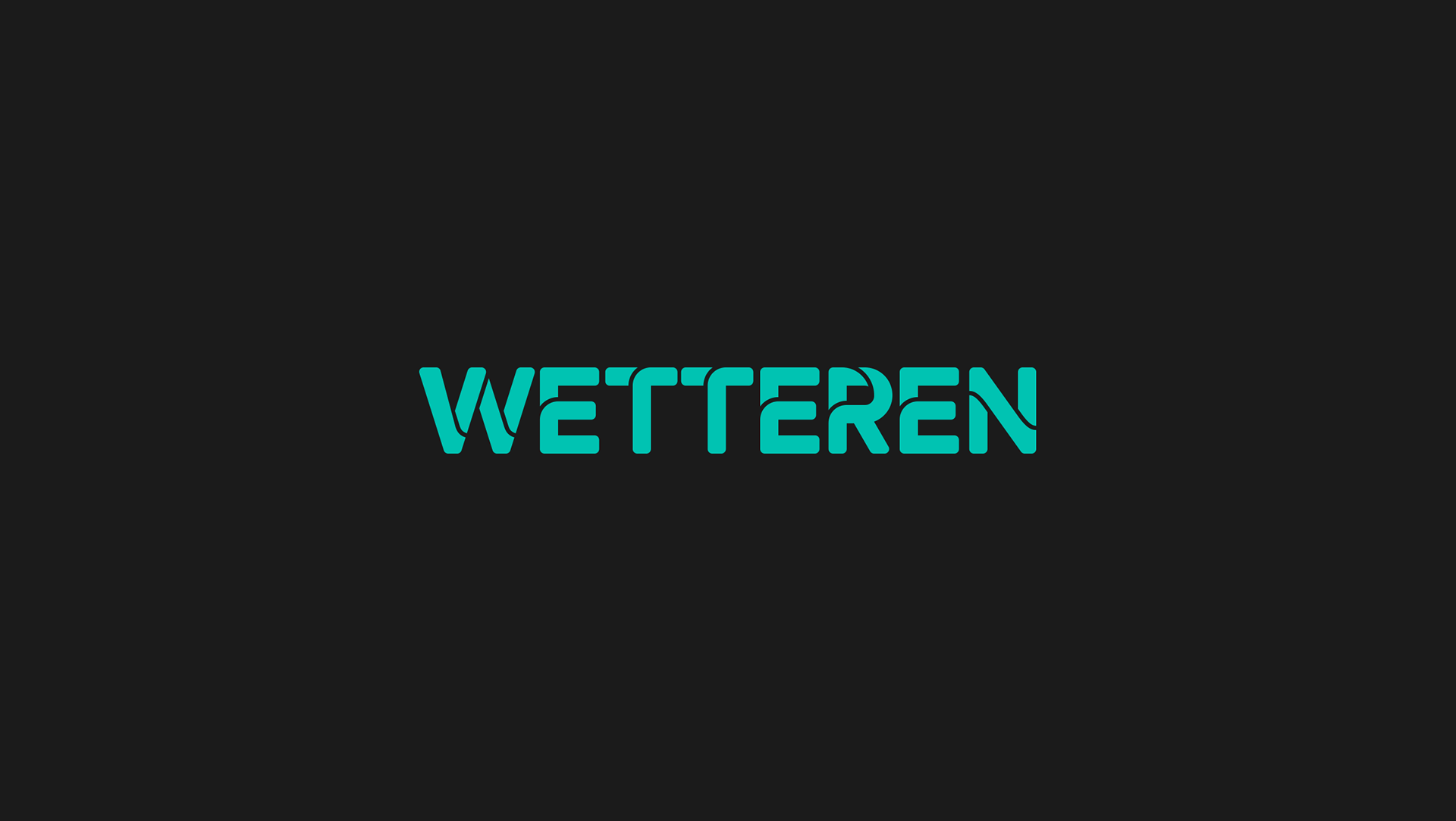
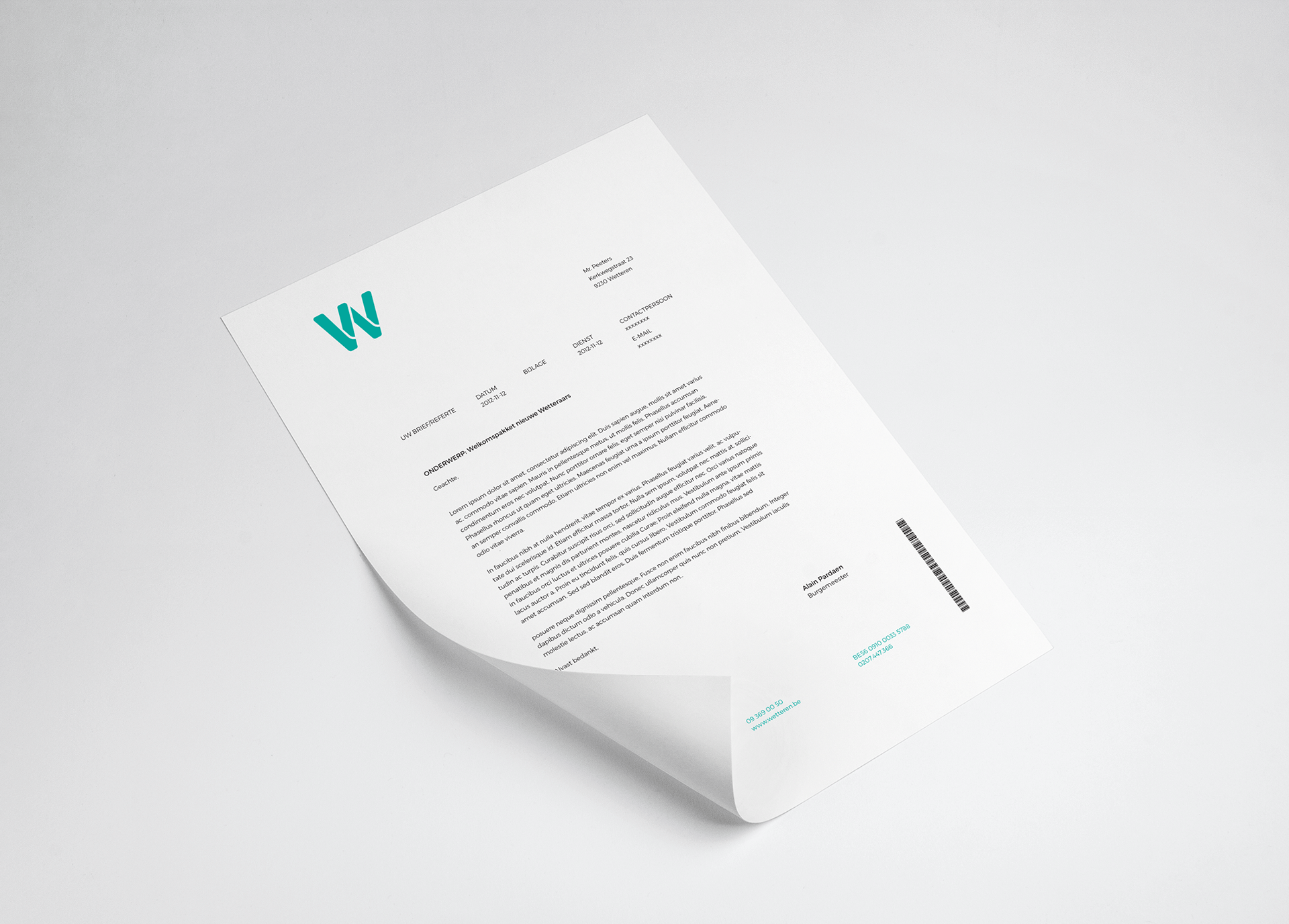
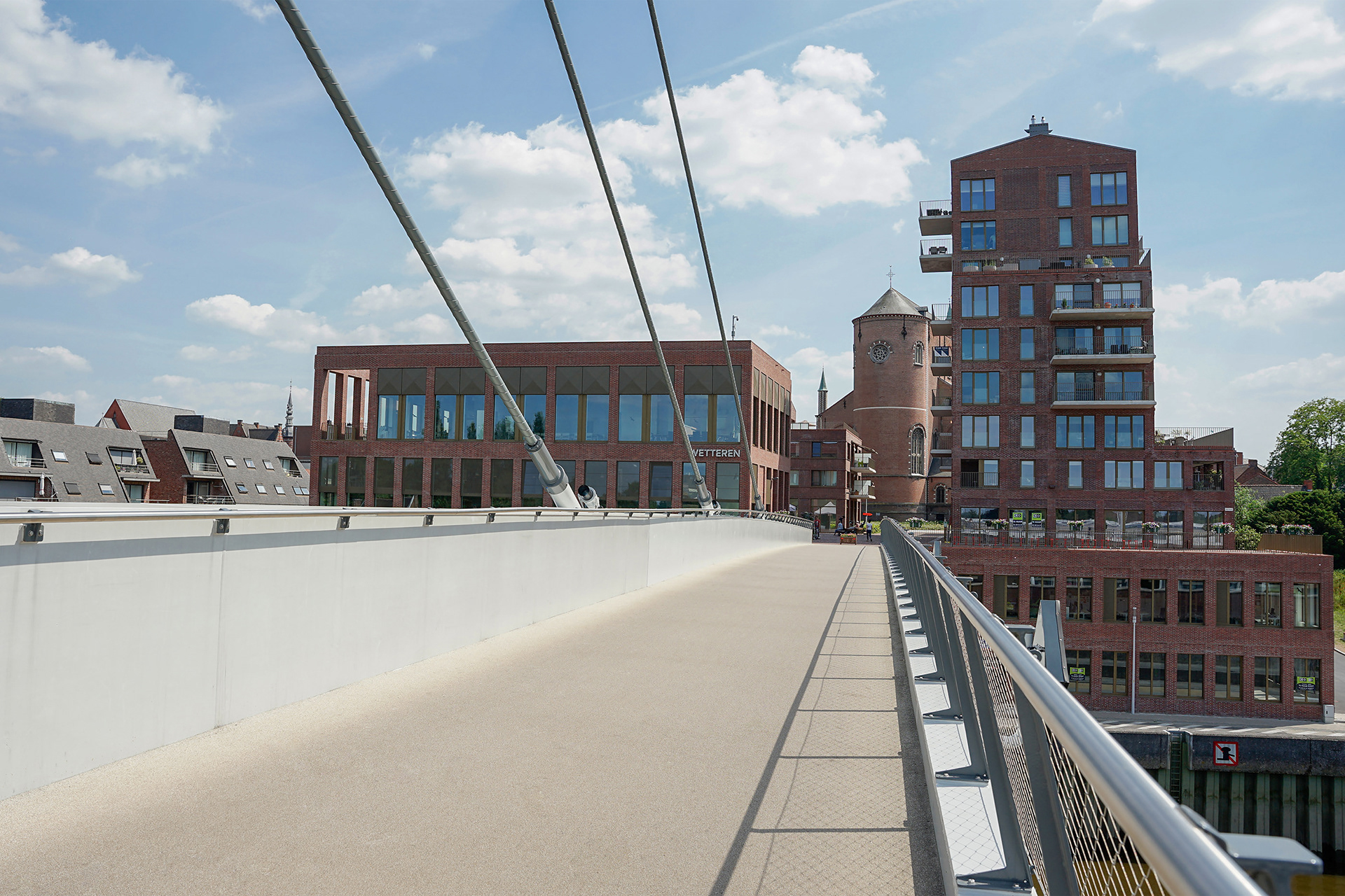
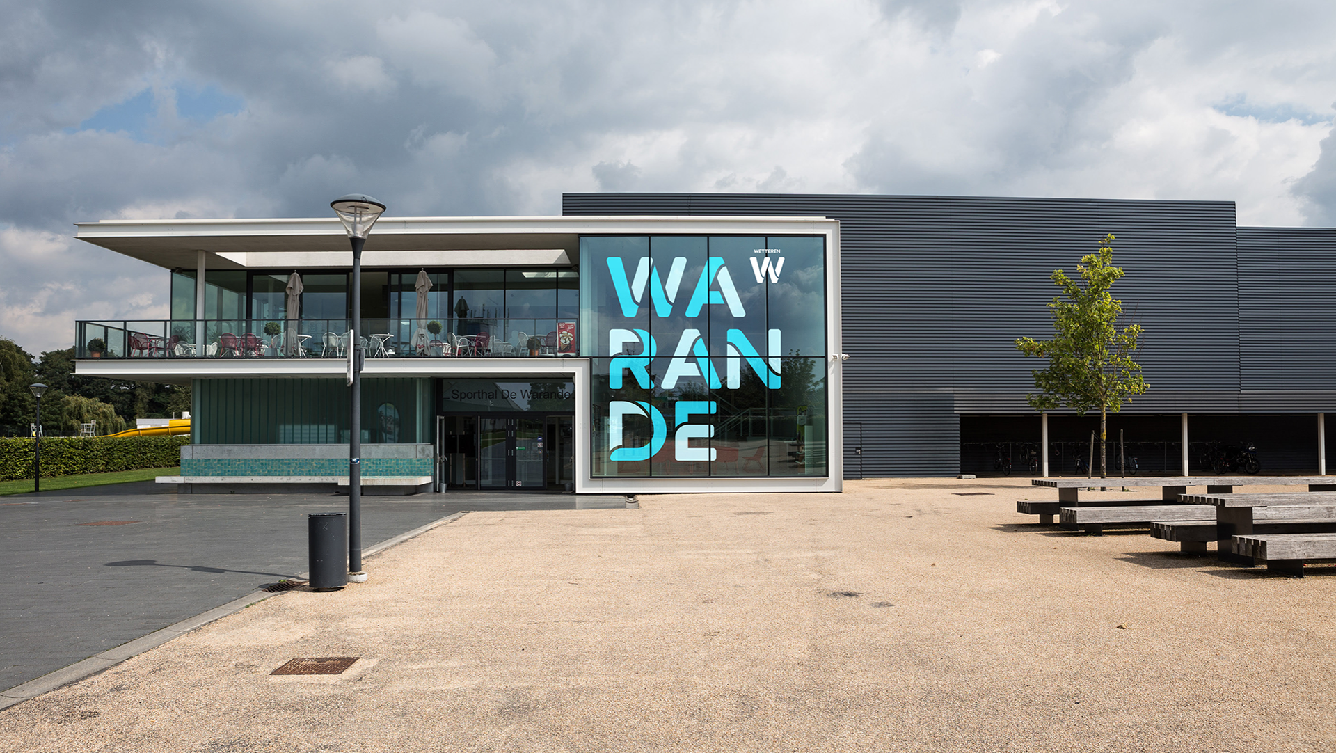
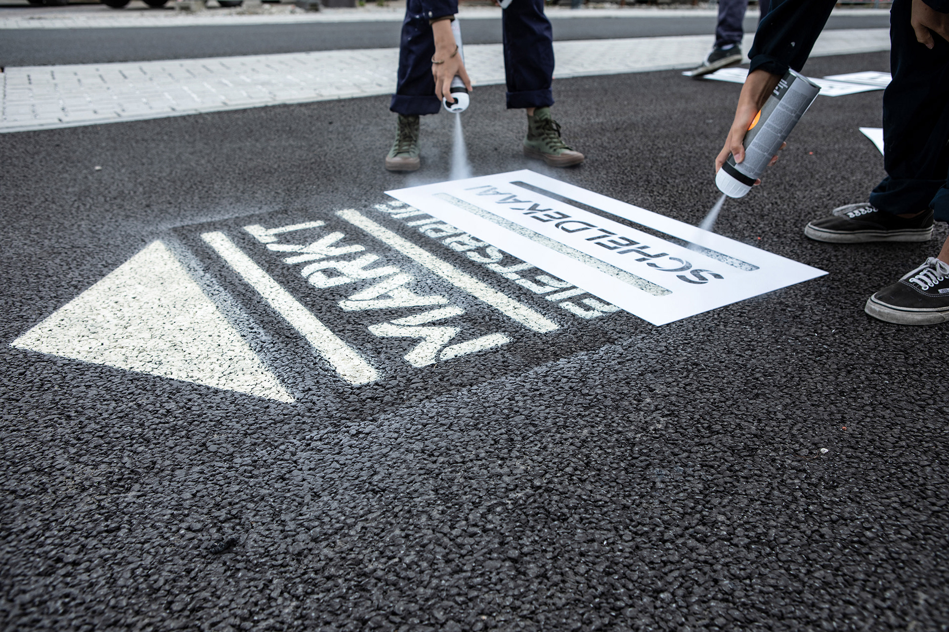
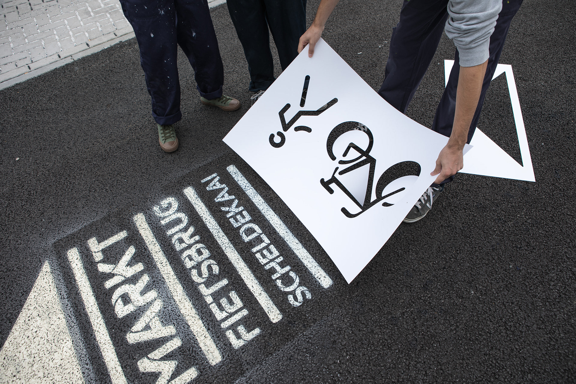
I collaborated with Coming Soon on a corporate identity built around a custom stencil font. The typeface was inspired by the flow of the river “De Schelde” which runs through the city. Wetteren Stencil is designed to make the new visual identity unique and memorable and it allows for the use of many different techniques such as die-cutting and stencilling. Through the typeface the branding is meant to create a dialogue between the city and the people interacting with it. This is exemplified in the images where the typeface is used in the public space as it intertwines with the people walking over or around it.
client
Wetteren
Wetteren
year
2018
2018
disciplines
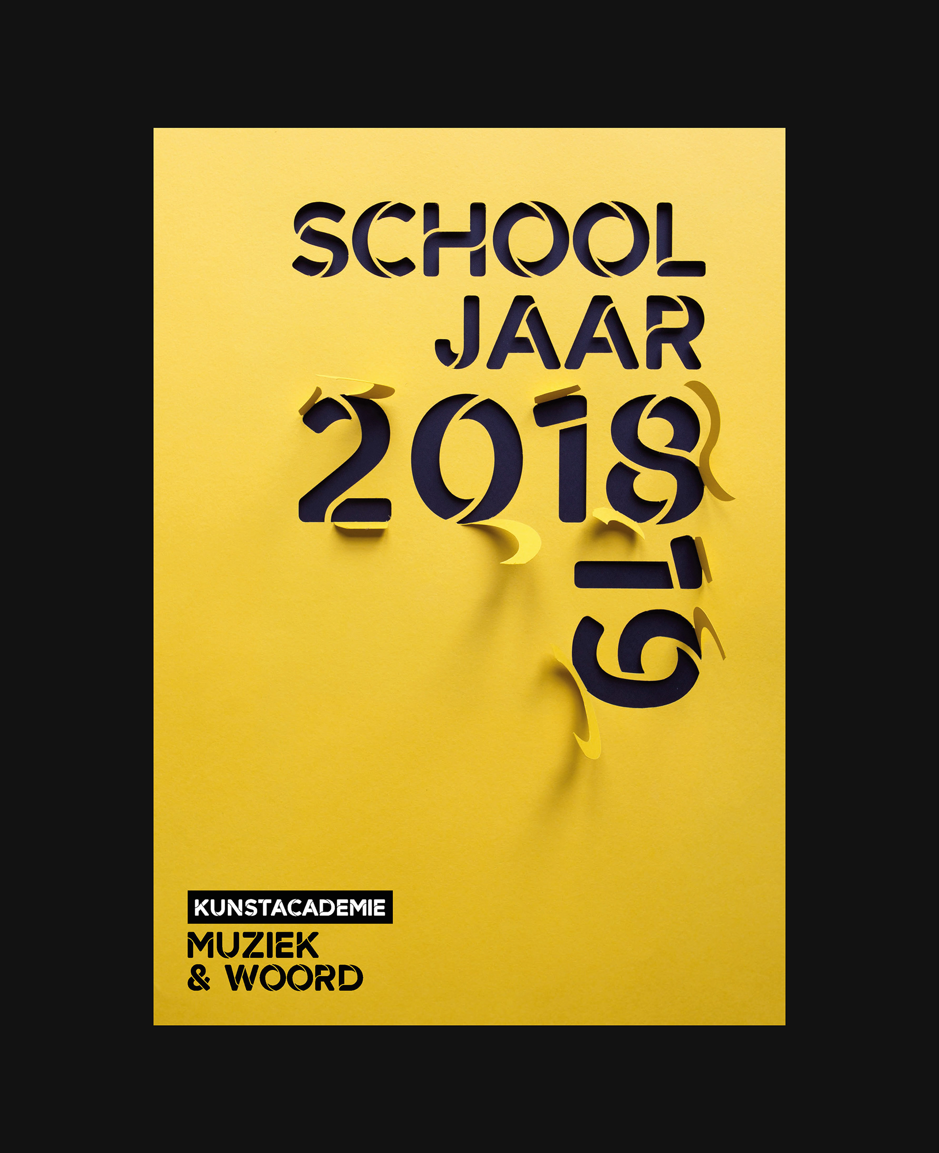
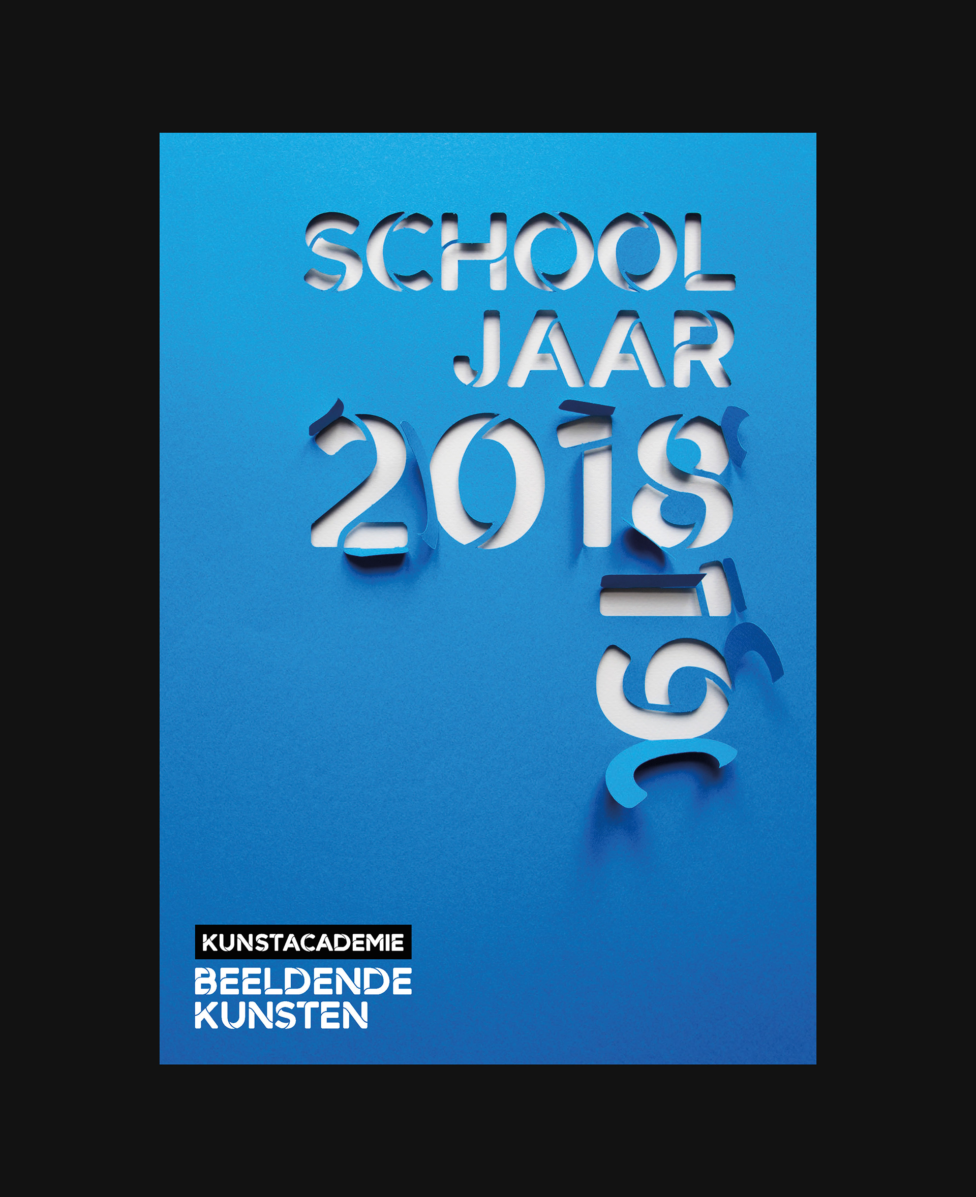
rebranding, visual identity, signage
rebranding, visual identity, signage
creative director
Jim Van Raemdonck
Jim Van Raemdonck
design
Ruben Van Aken, Emiel Penninckx, RikGrafiek (Rik Staesens)
Ruben Van Aken, Emiel Penninckx, RikGrafiek (Rik Staesens)
typeface design
RikGrafiek (Rik Staesens), soon
RikGrafiek (Rik Staesens), soon
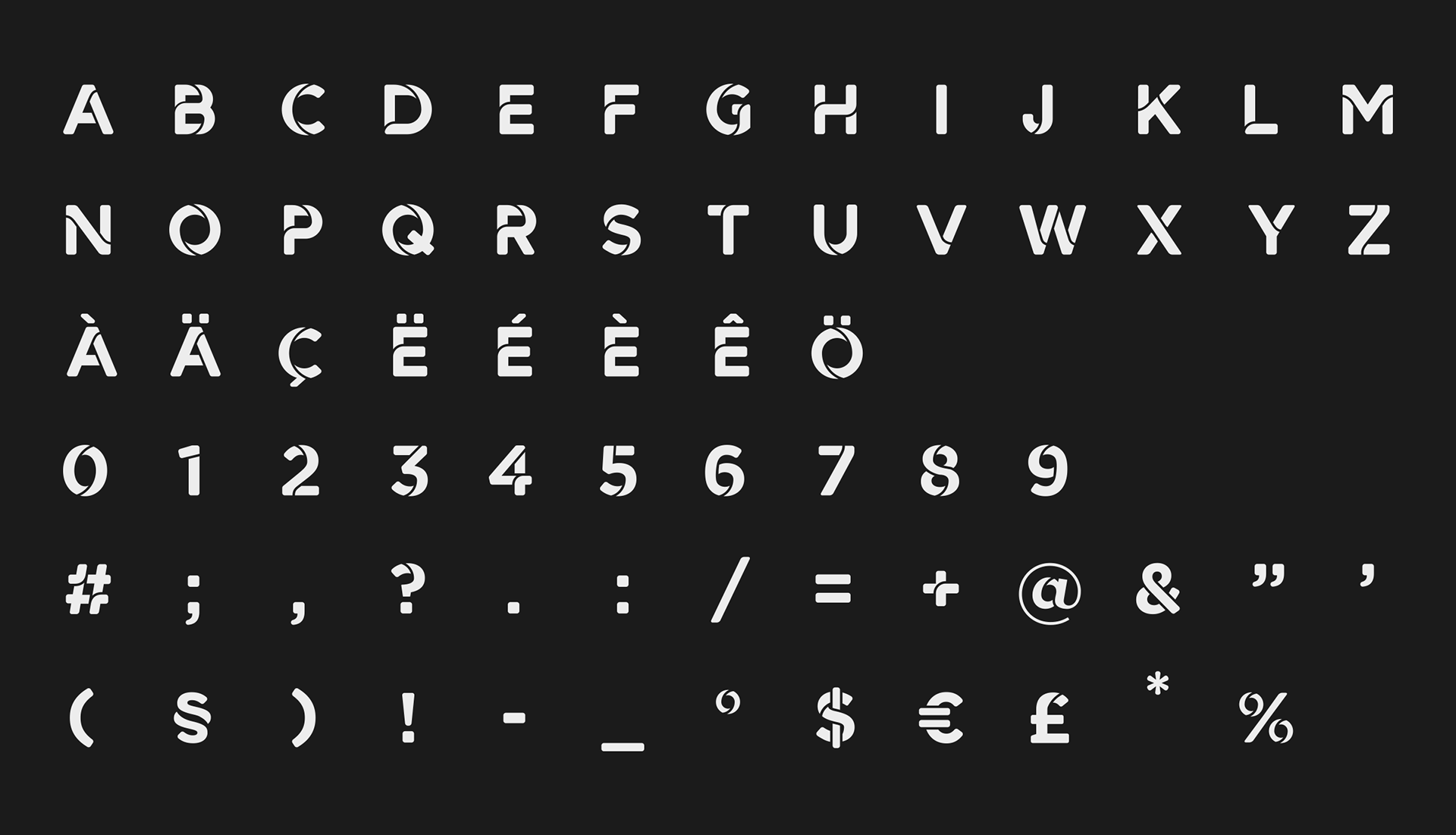

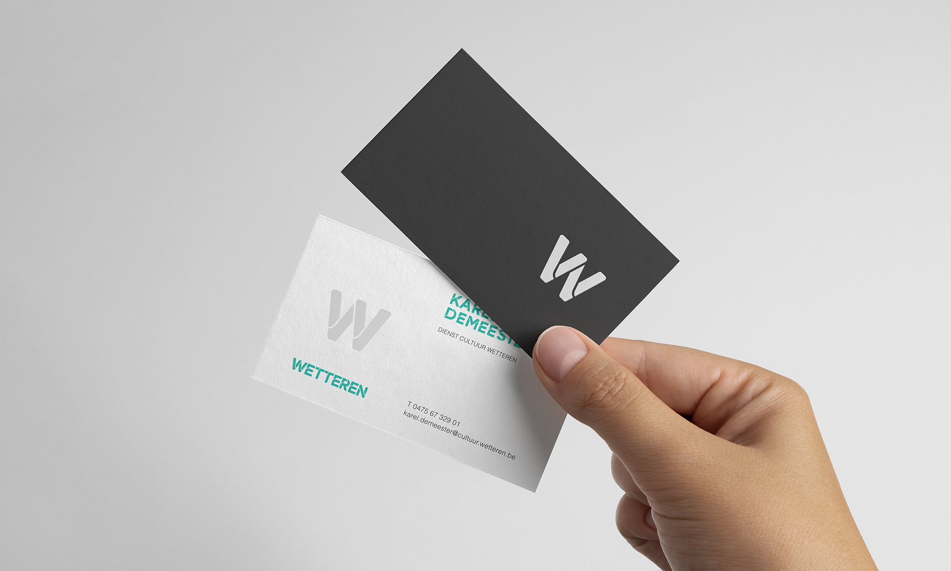
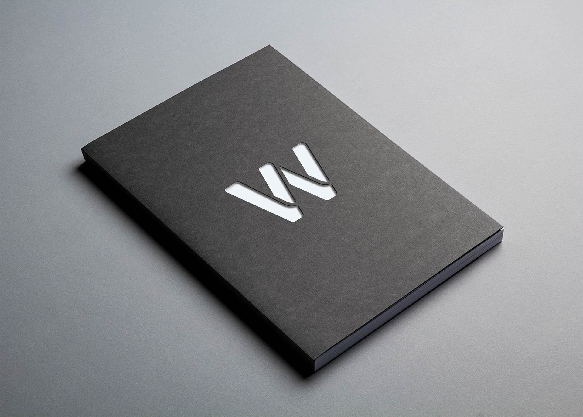

The stencil font allows for die cut finishing of notebooks and business cards.

Images © Coming Soon
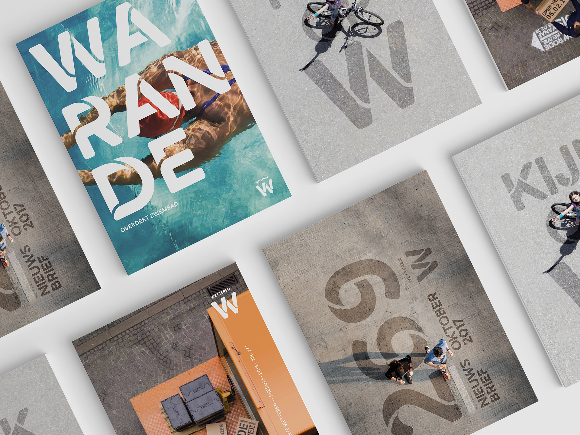
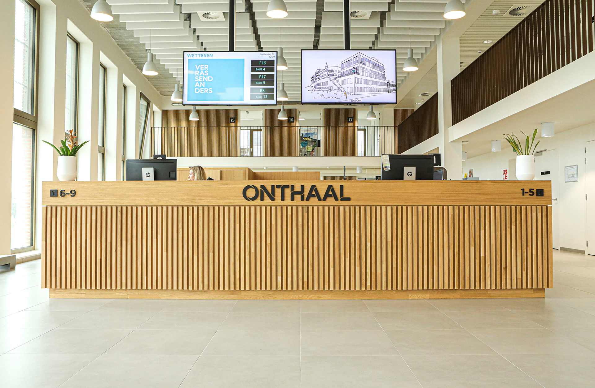
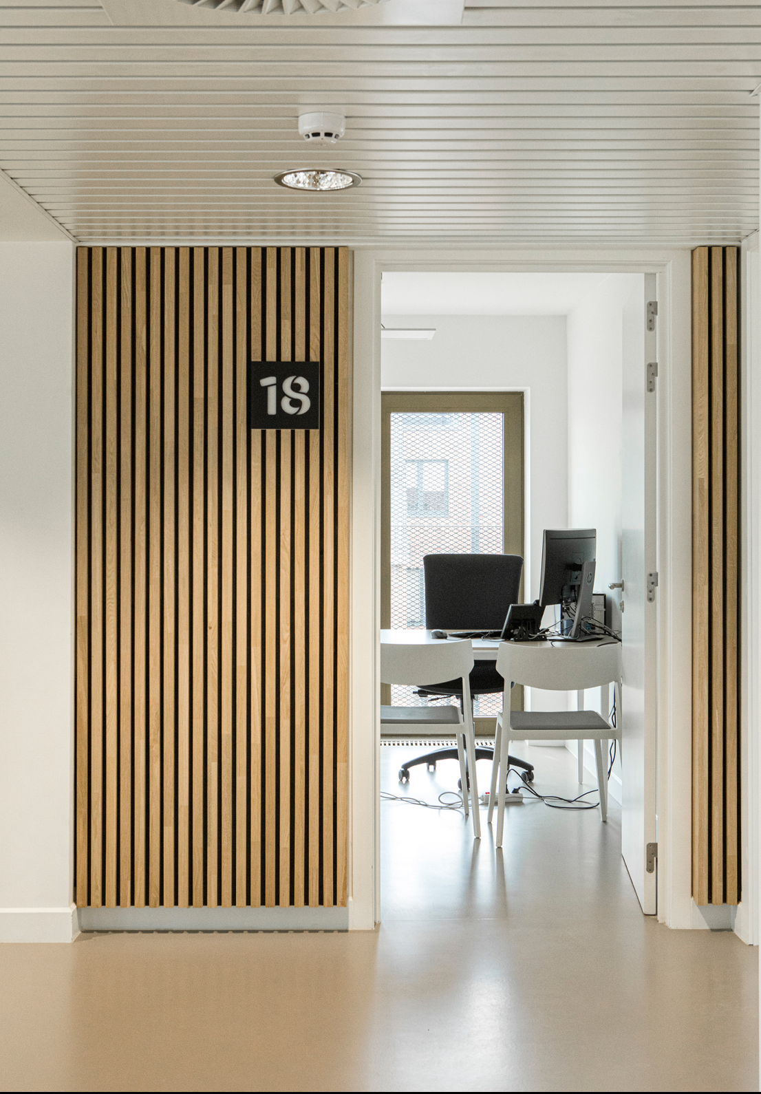
Examples of the identity in use. The typeface creates a dialogue between the city and the people interacting with it. This is exemplified in the images where the typeface is used in the public space as it intertwines with the people walking over or around it.
Concept Coming Soon & RikGrafiek - Graphic design by Coming Soon.
Images courtesy of Coming Soon
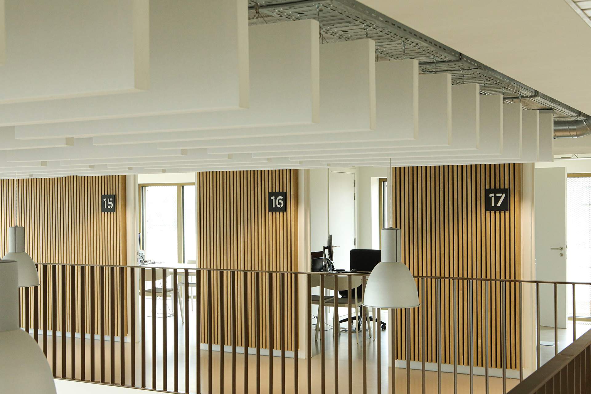
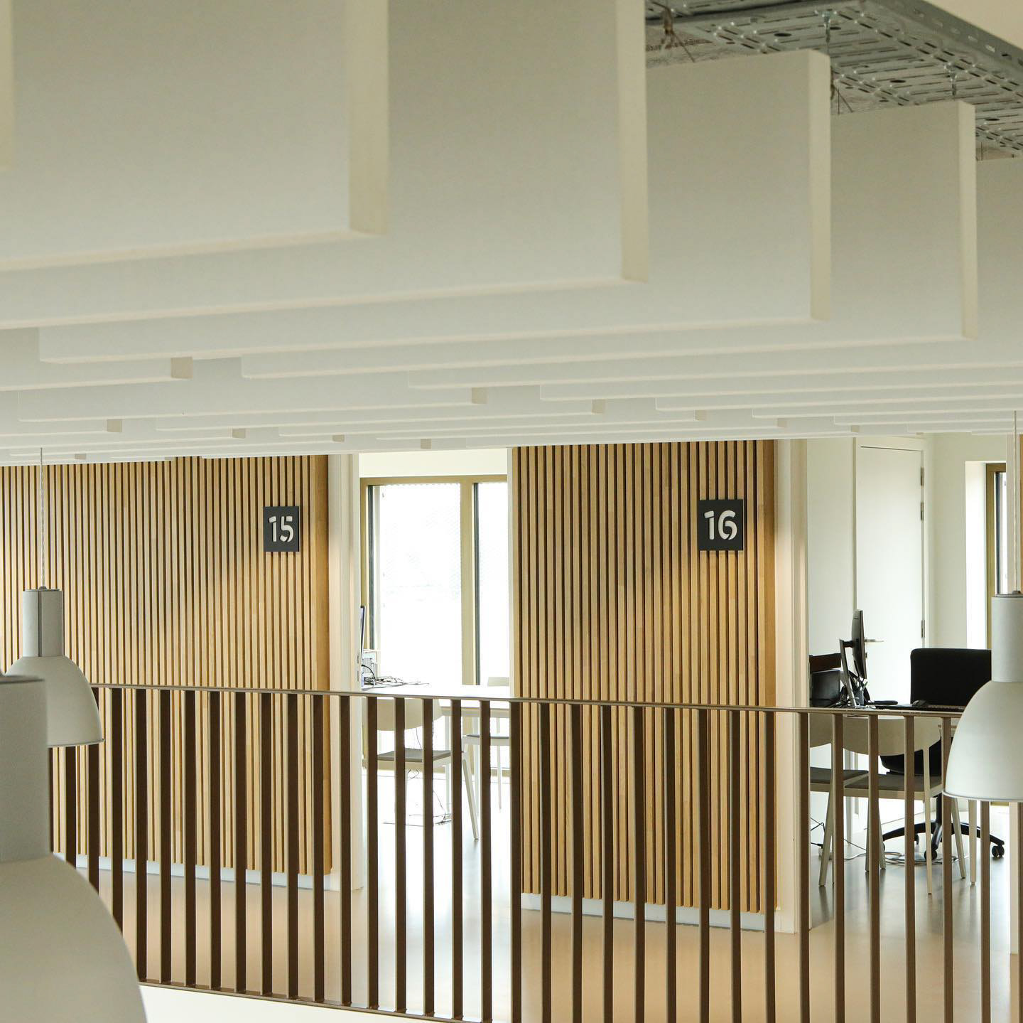
The Wetteren Stencil typeface in use. Signage and campaign images by Coming Soon © Coming Soon