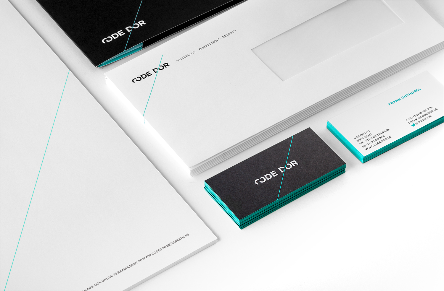
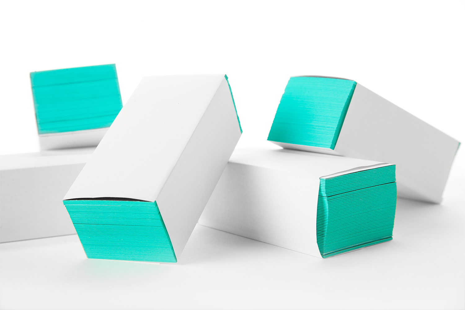
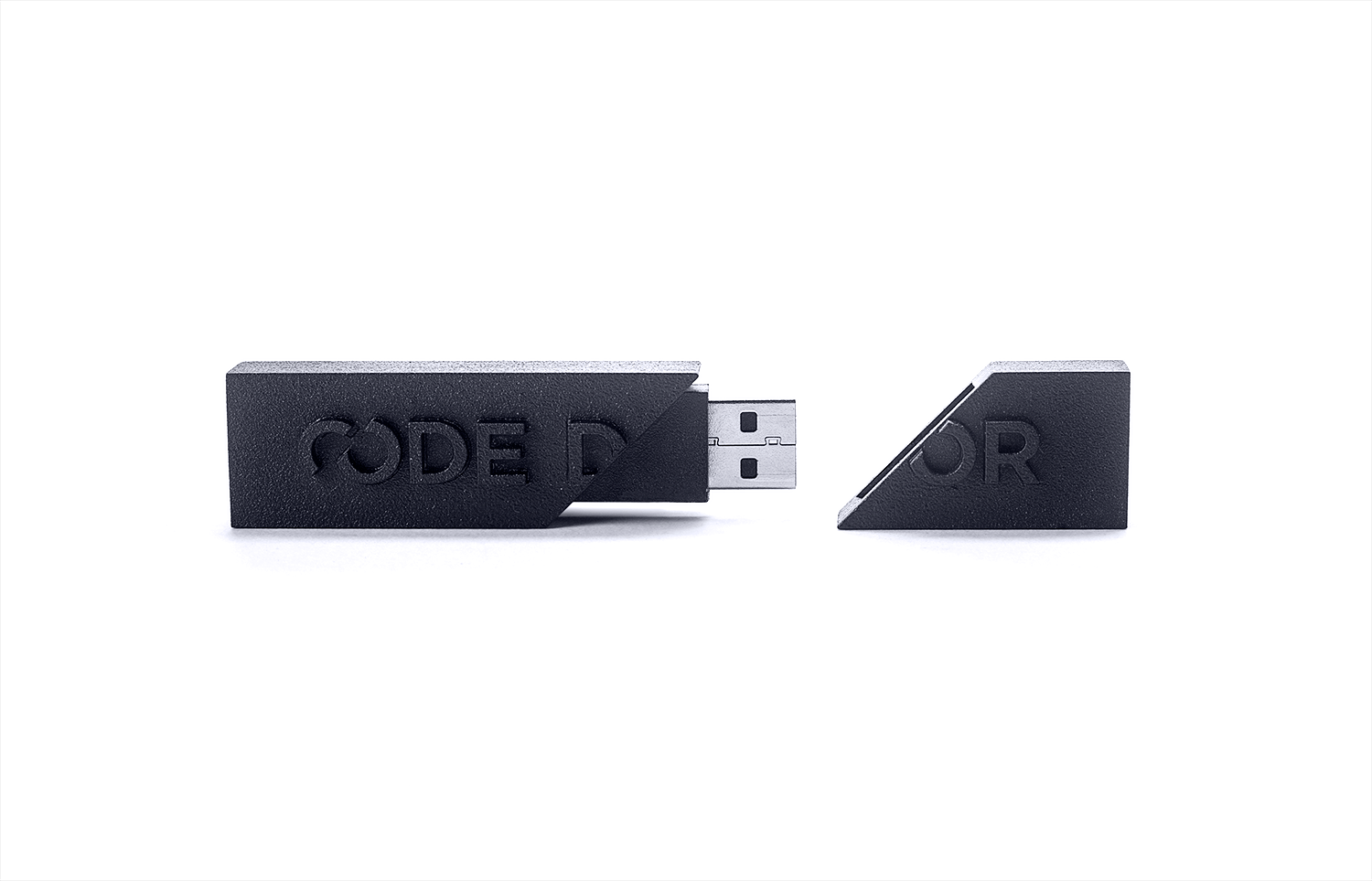
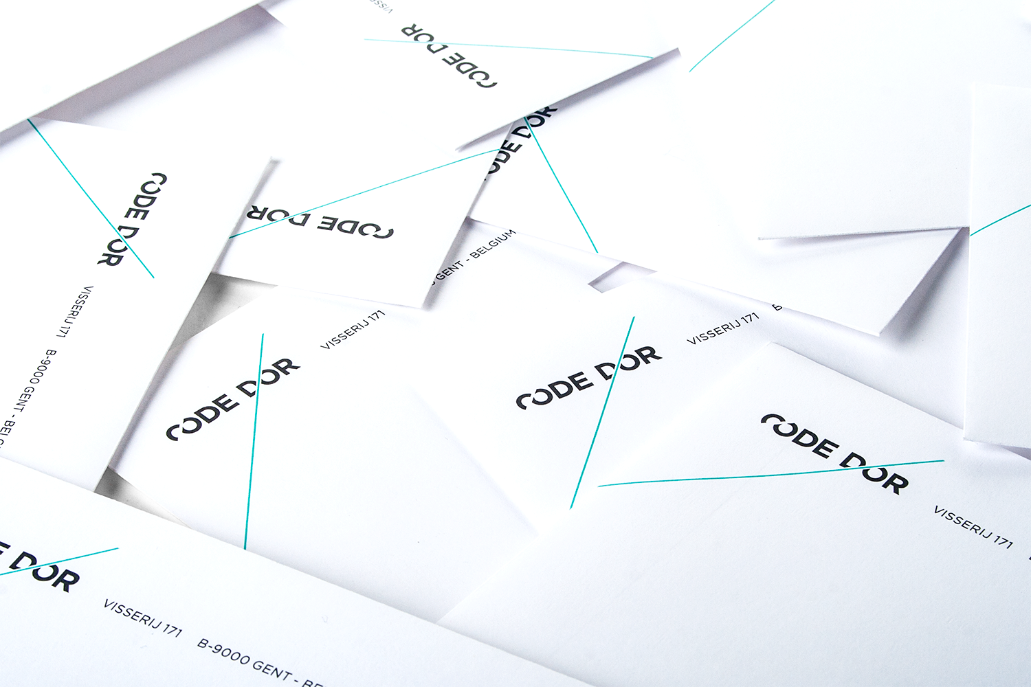
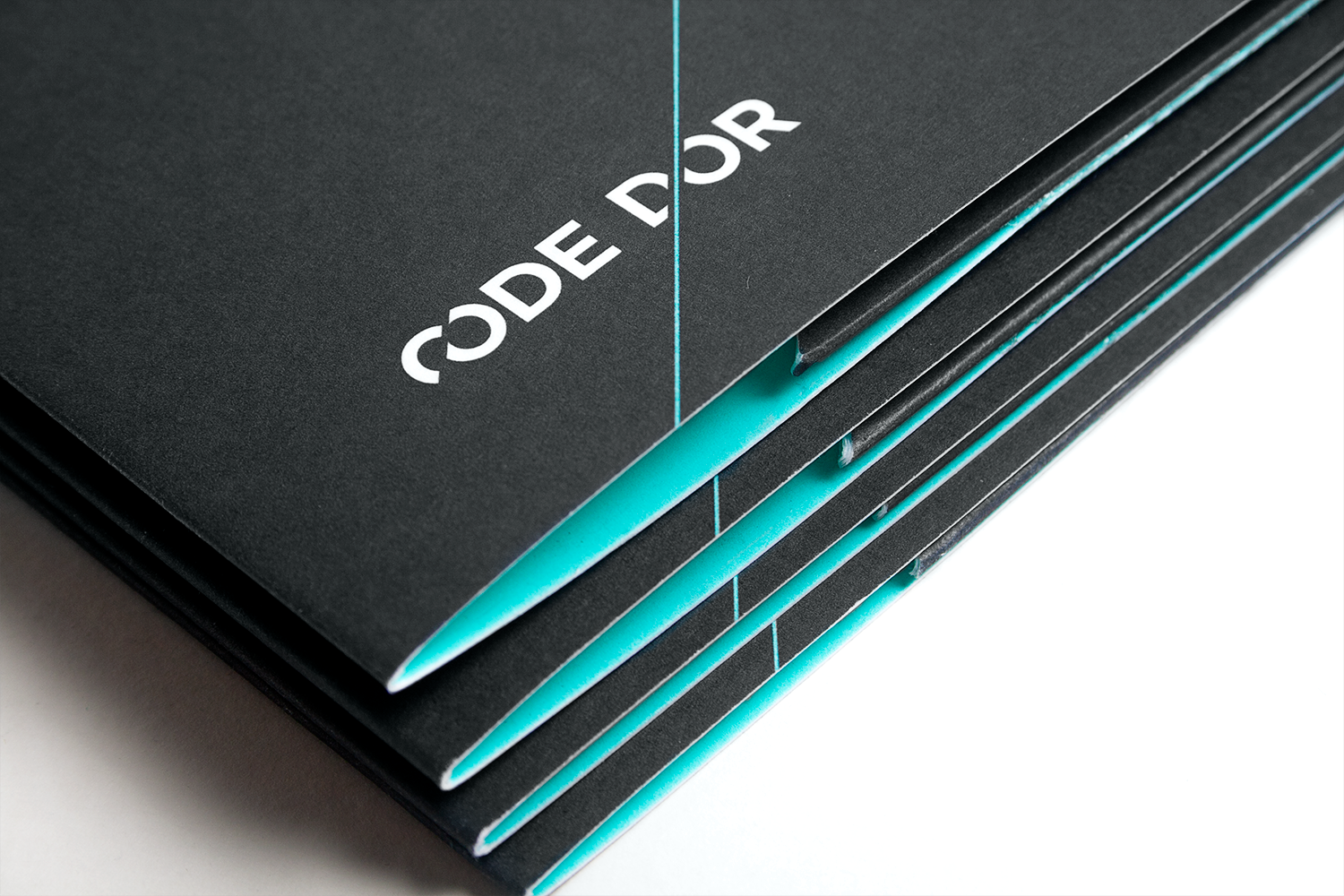
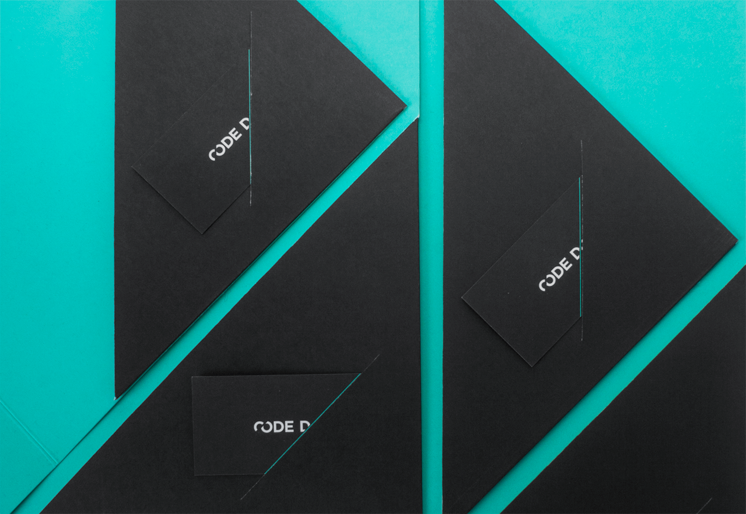
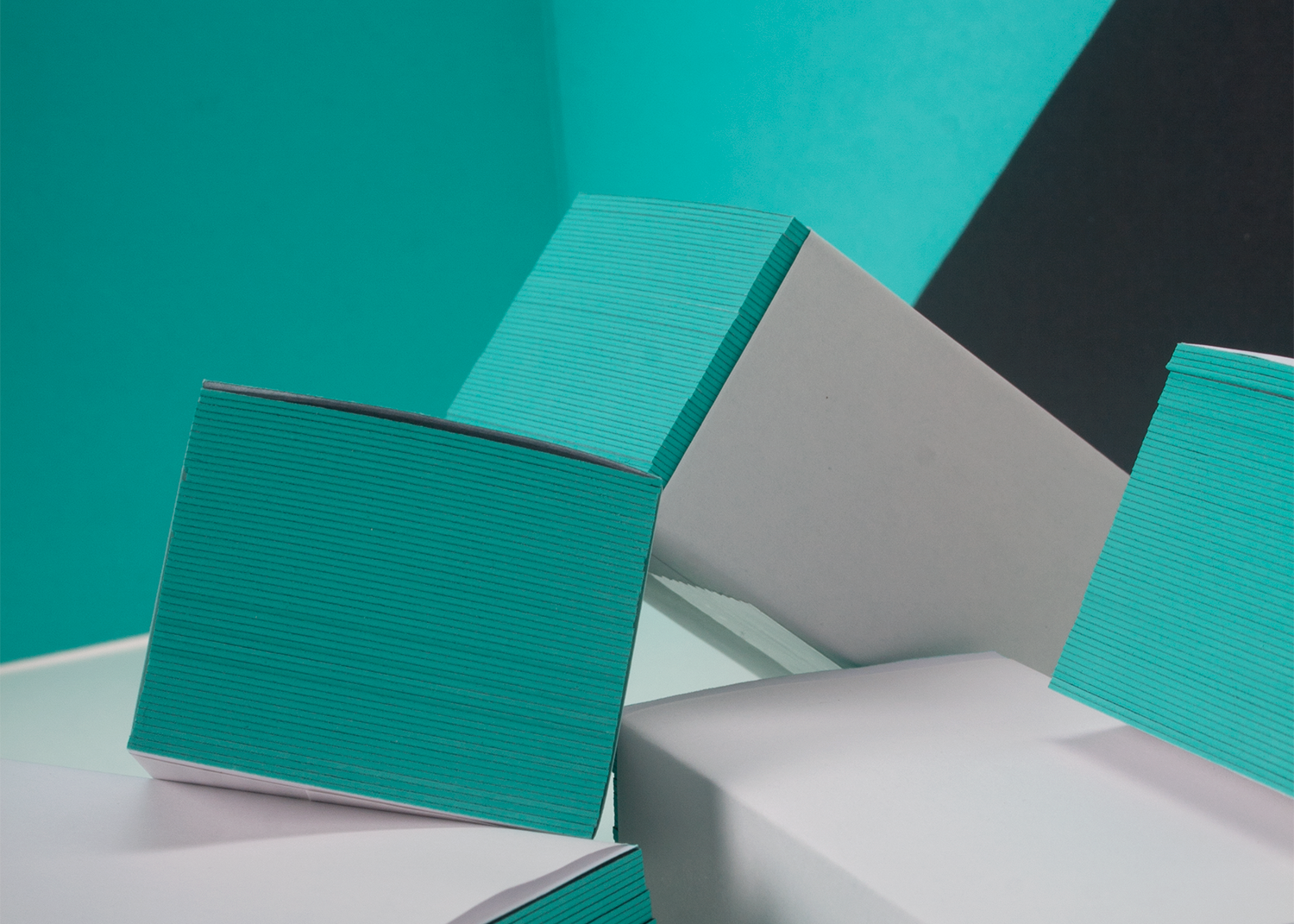
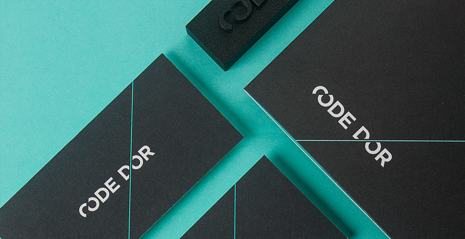
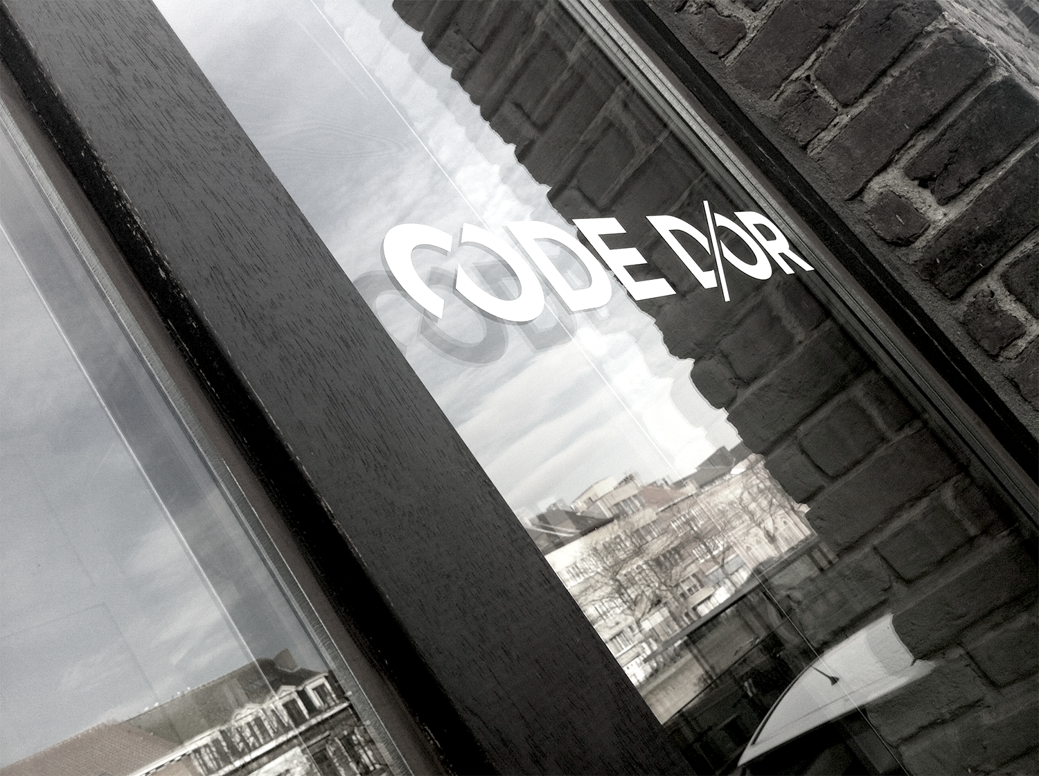
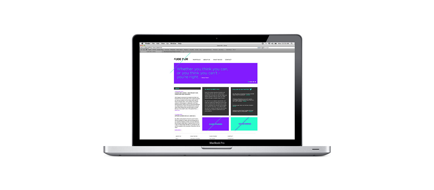
Code D'or wanted a distinct and strong word mark and a graphic element that could be used throughout the identity. The slice that replaced the apostrophe functions as a dynamic design solution providing the logo with a different shape depending on its use and placement. The contrasting color palette gives the identity a contemporary feel and merges the creative side of the company with its more serious business side.
This project was featured in Hightone's 'Good Idea 3' publication.


Project was featured in Good Idea 3, published by Hightone Books