Outsource, a data-driven PR & Corporate Comms agency marked its 30th anniversary in 2023. Embracing this significant milestone, the Brussels outskirts-based agency's visual identity underwent a thorough transformation, opting for a complete overhaul and a fresh start.
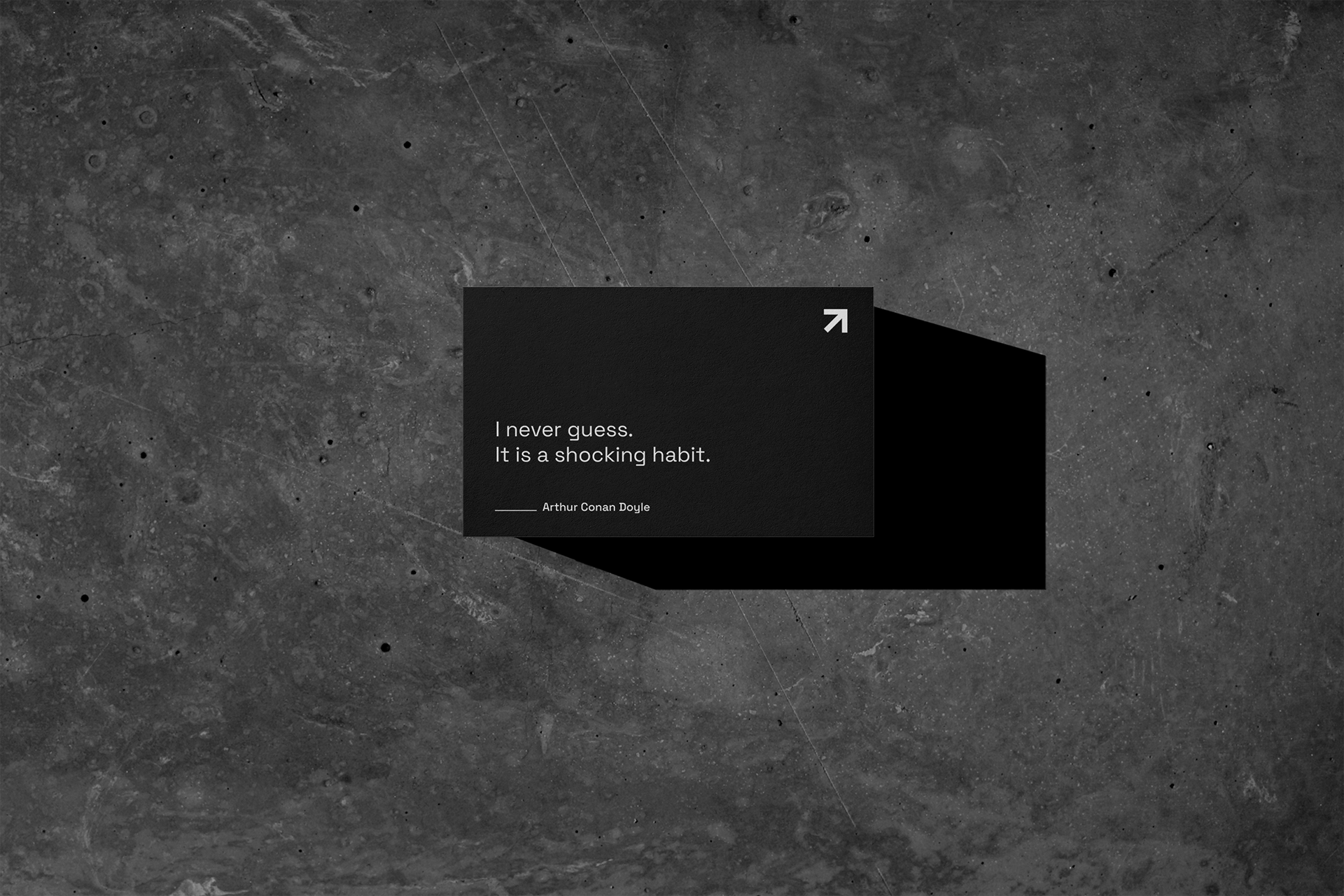
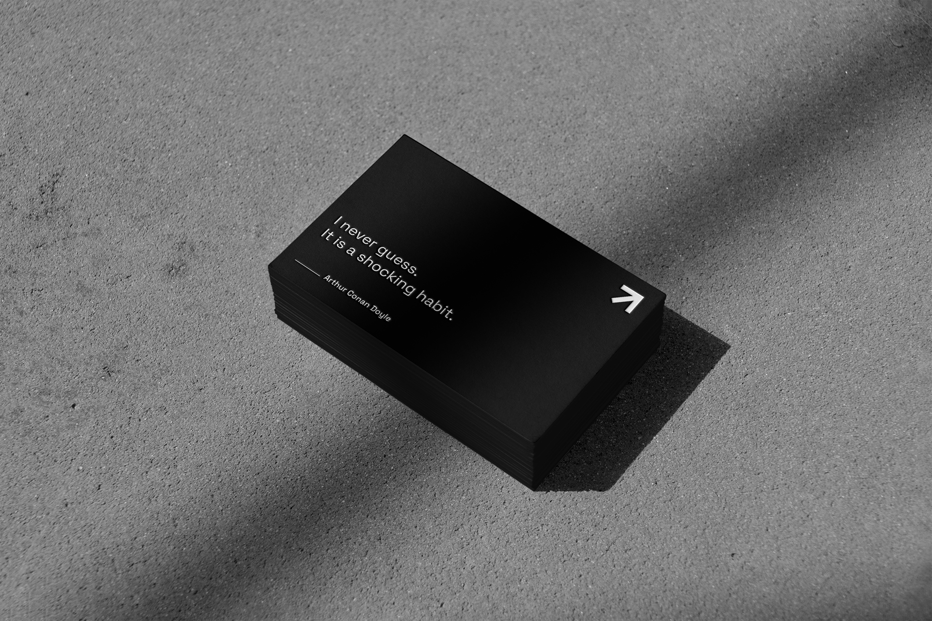
During initial discussions, the company emphasized its desire for a blank slate, recognizing that the existing logo and visual identity no longer reflected its essence. At Outsource, reliance on data over guesswork is a fundamental principle. The decision to revamp the identity aimed to convey this commitment.
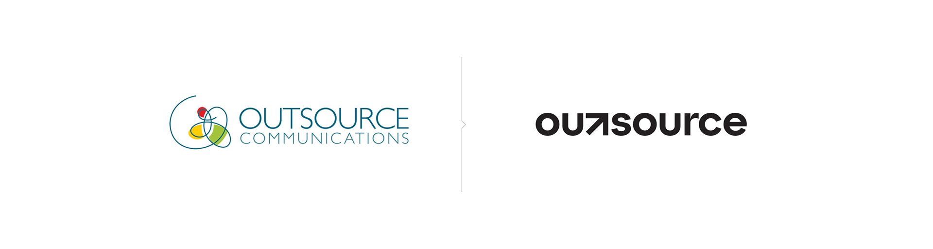
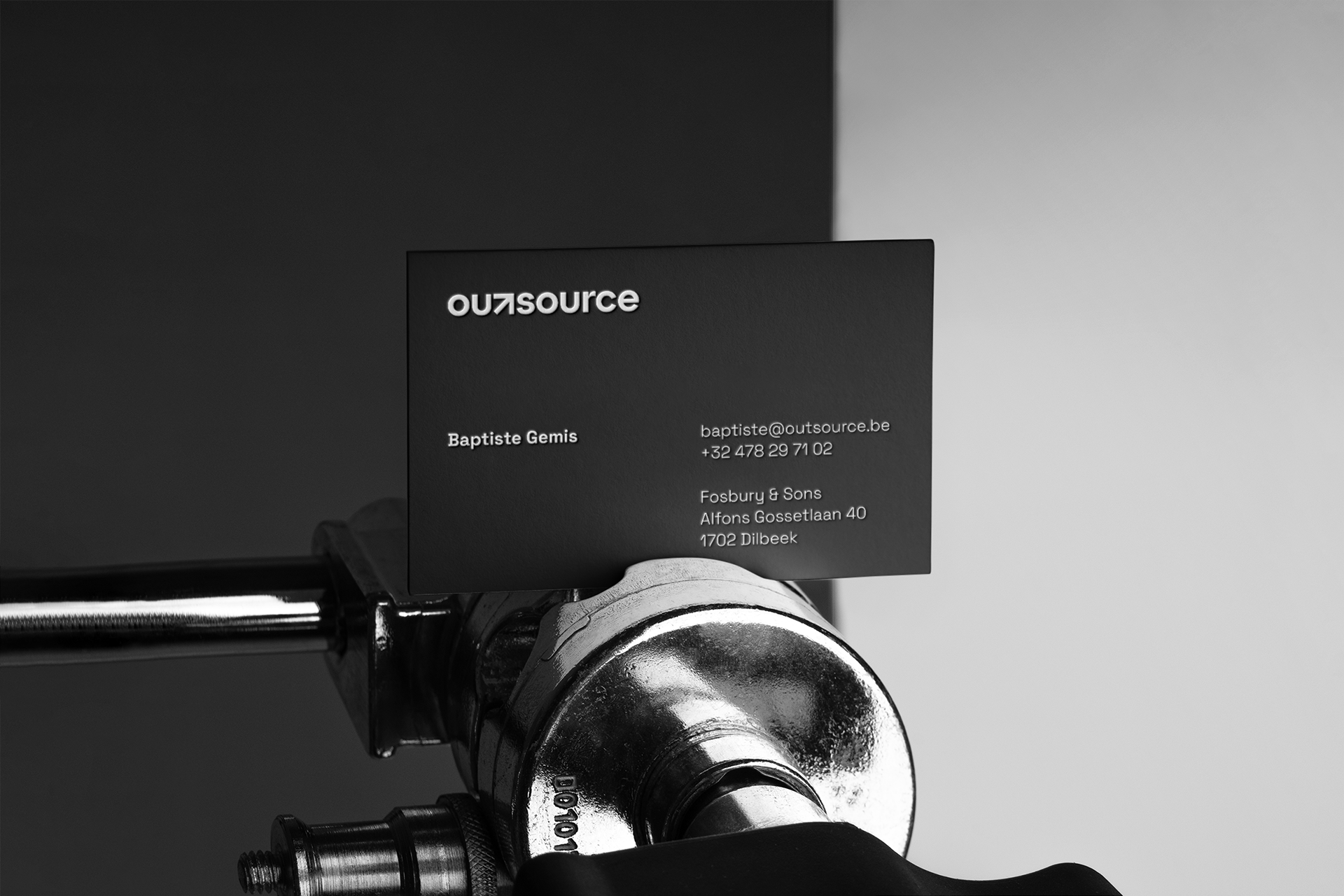
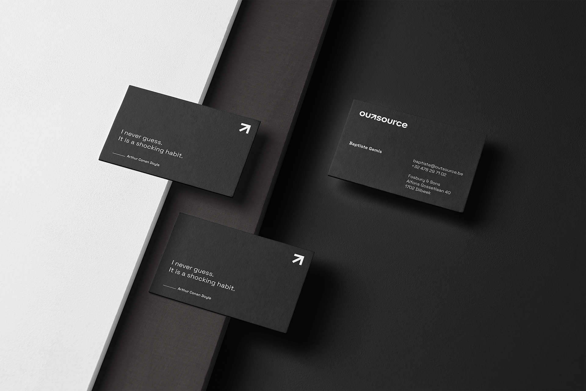
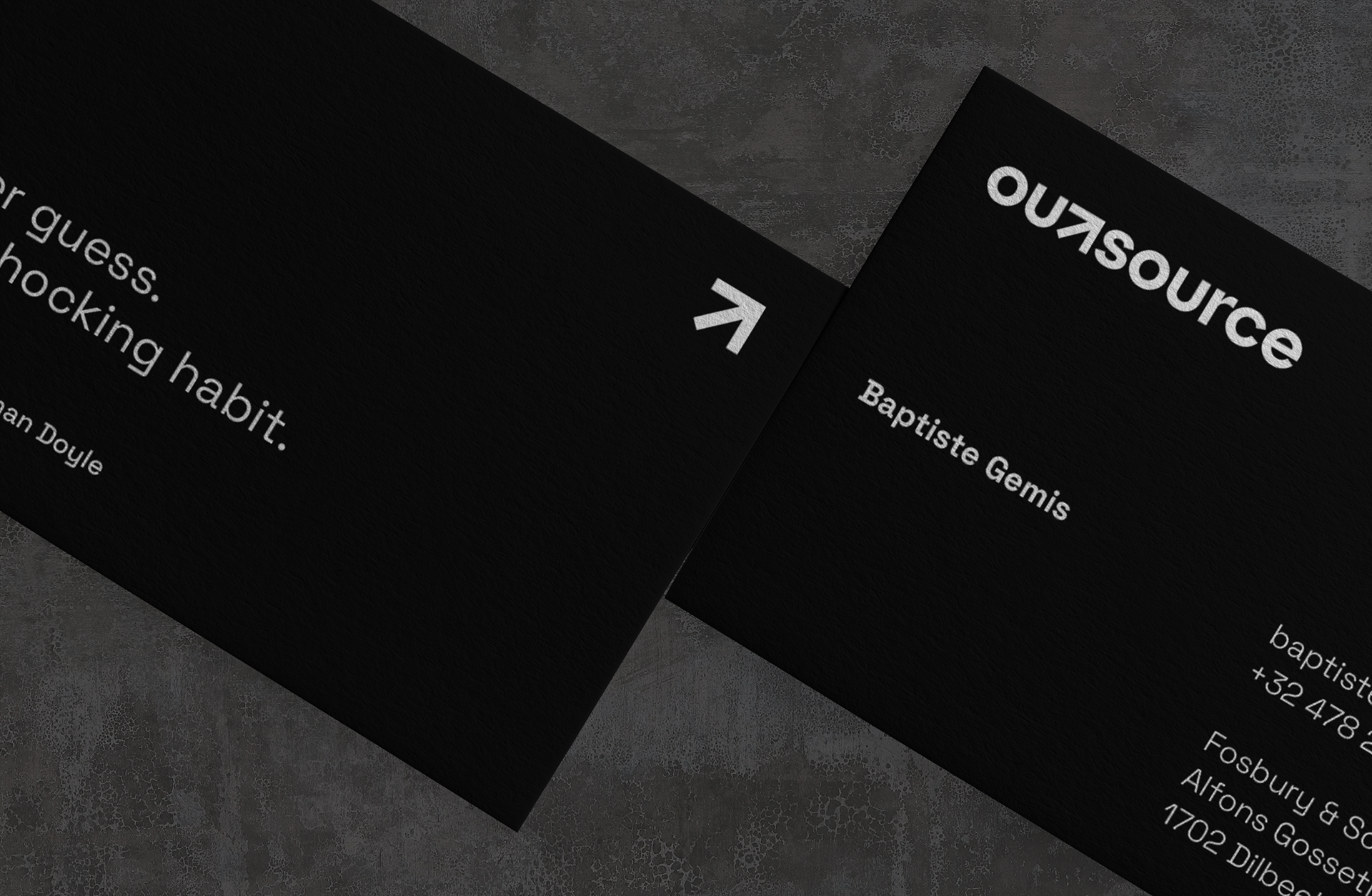
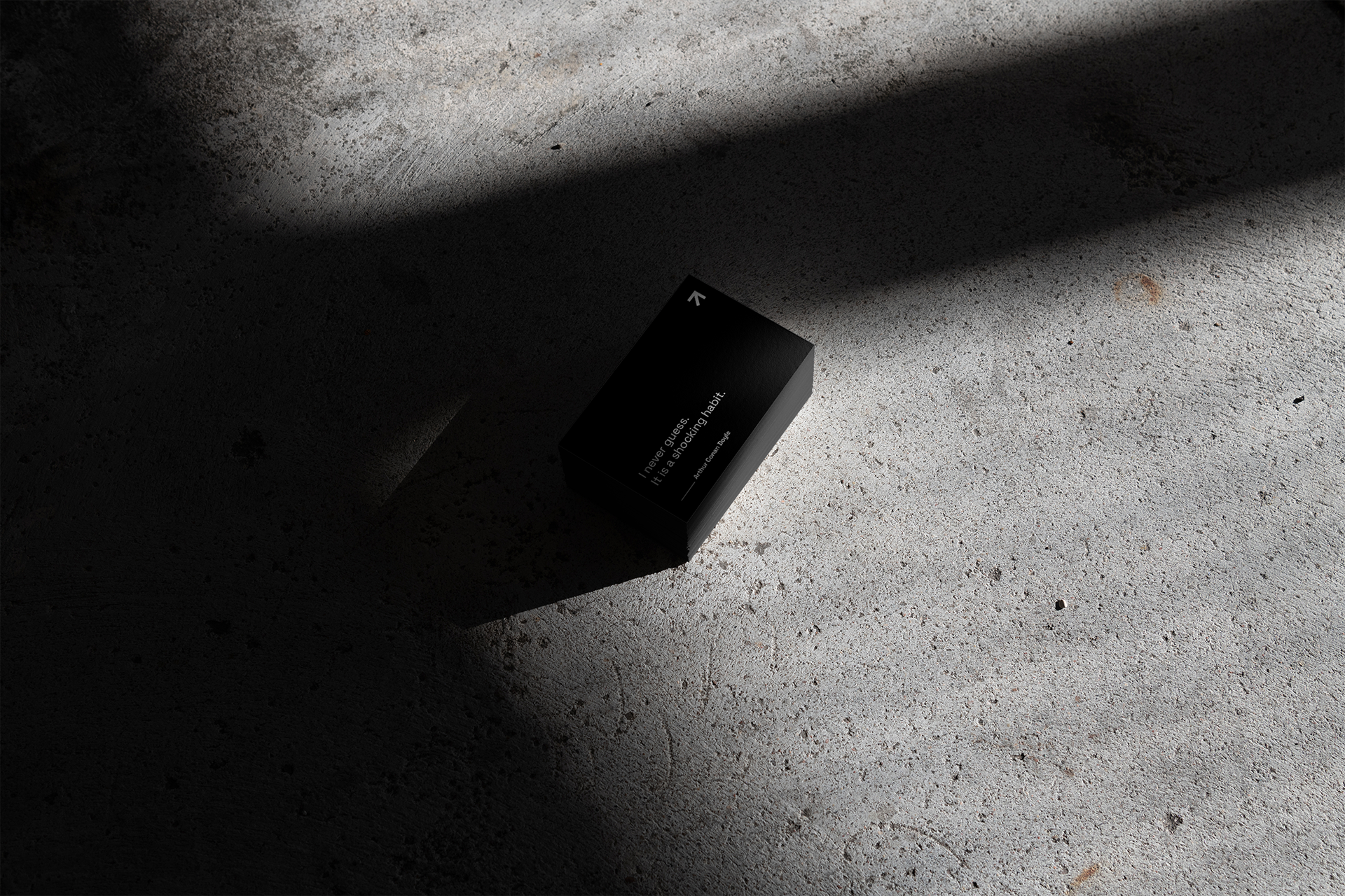
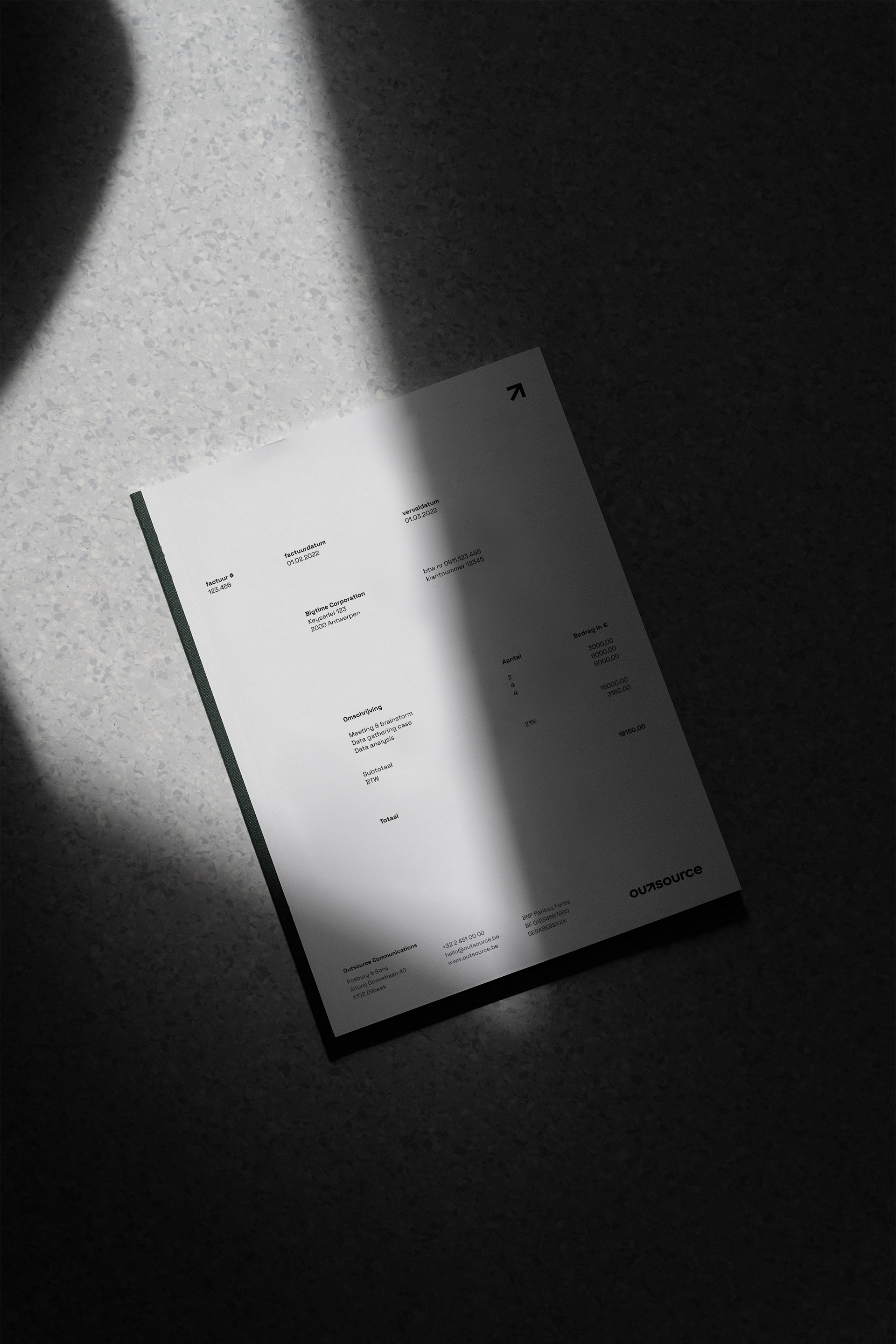
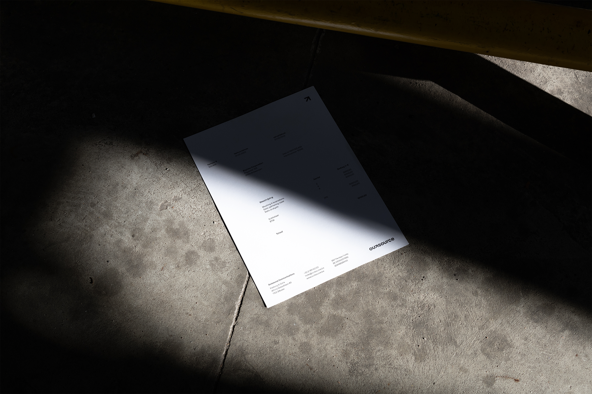
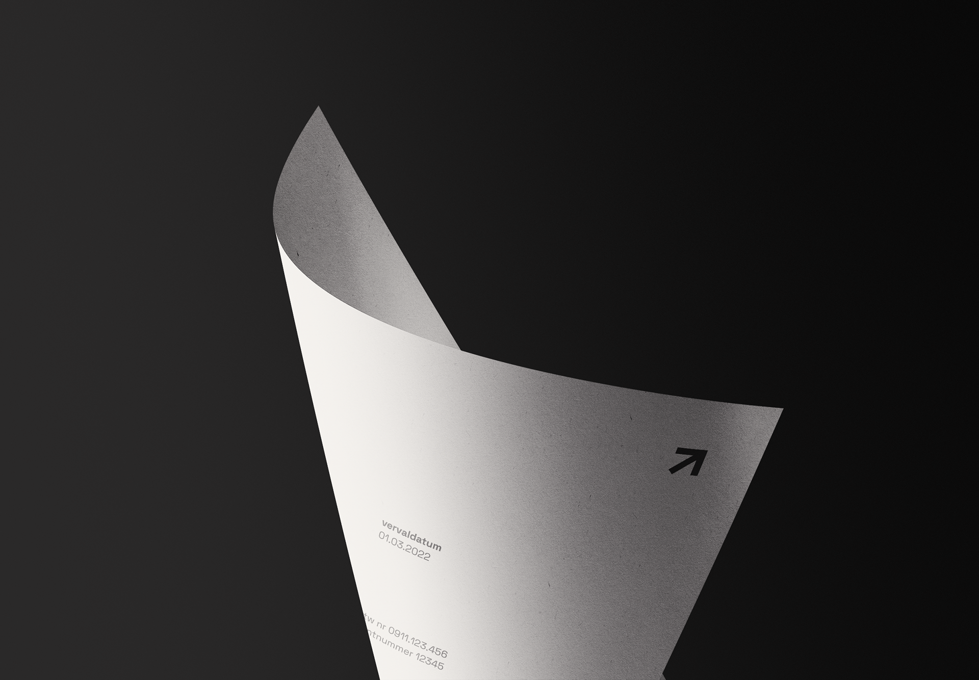
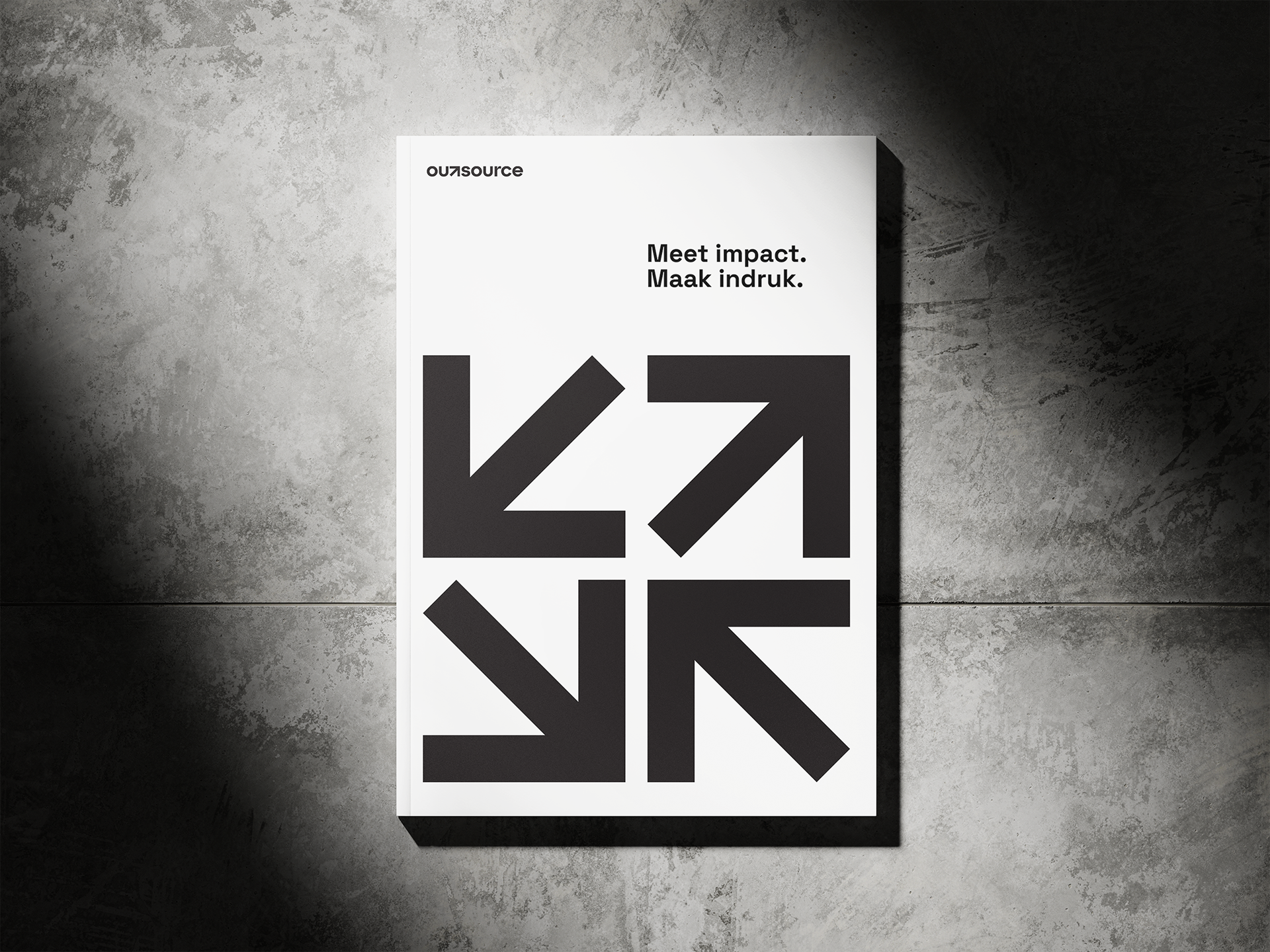
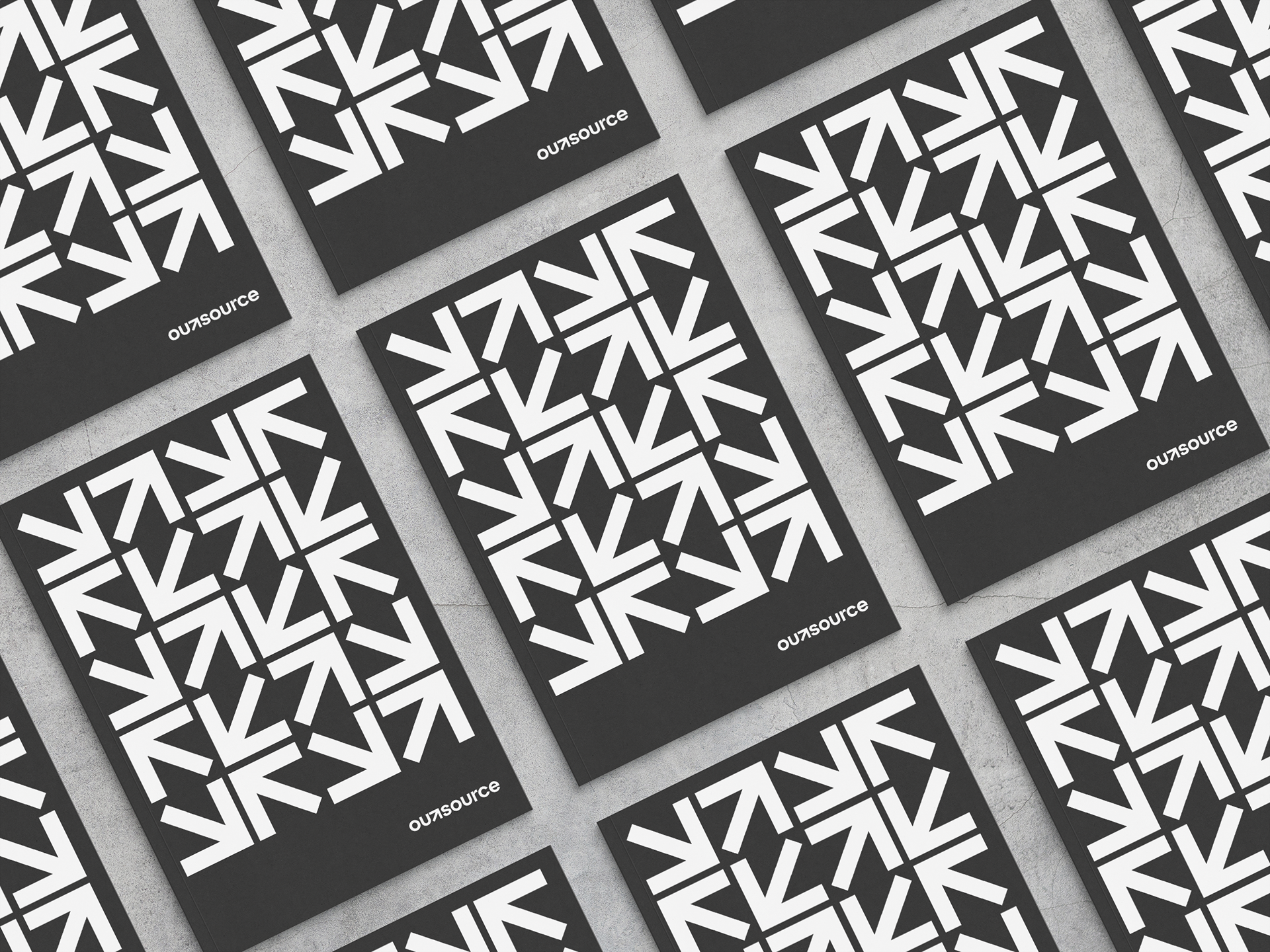
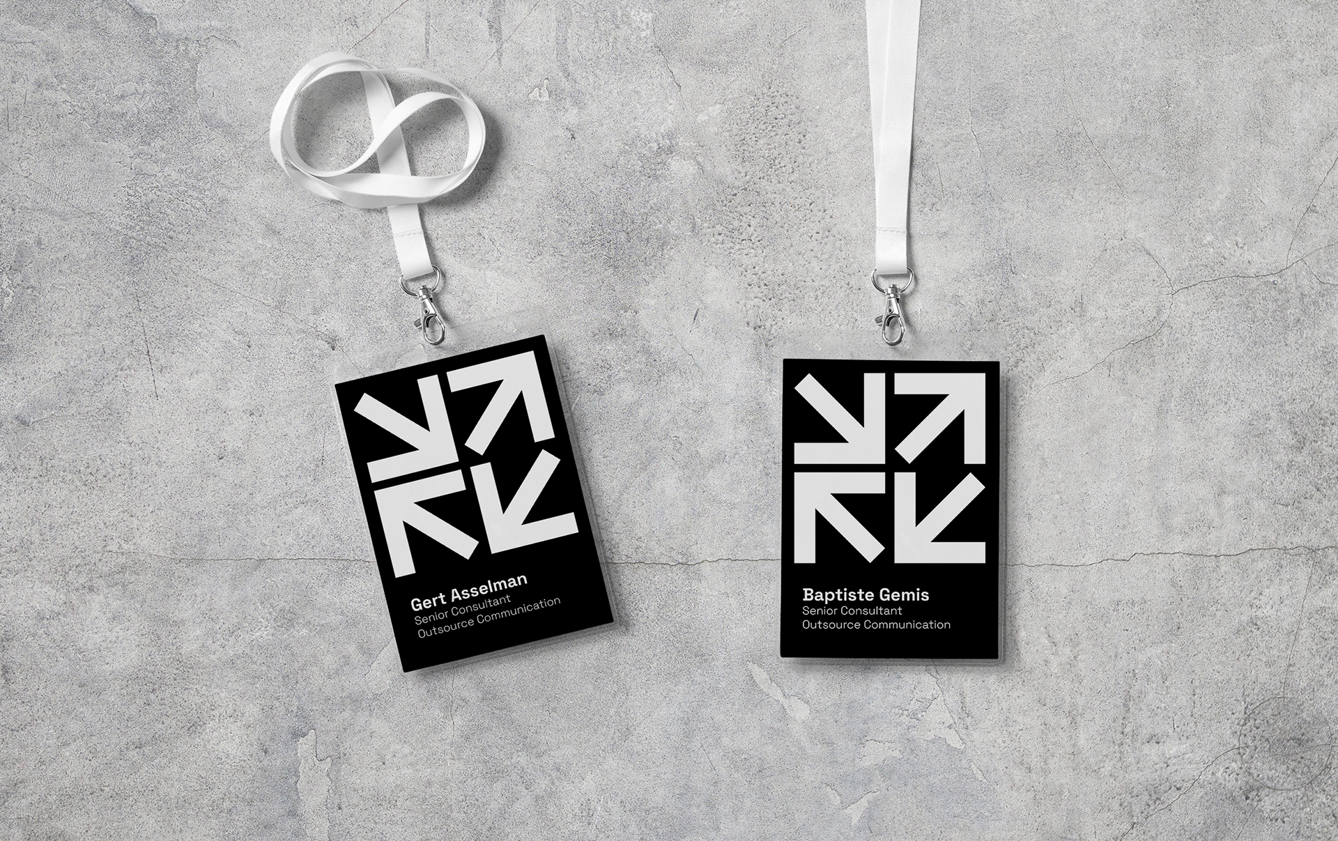
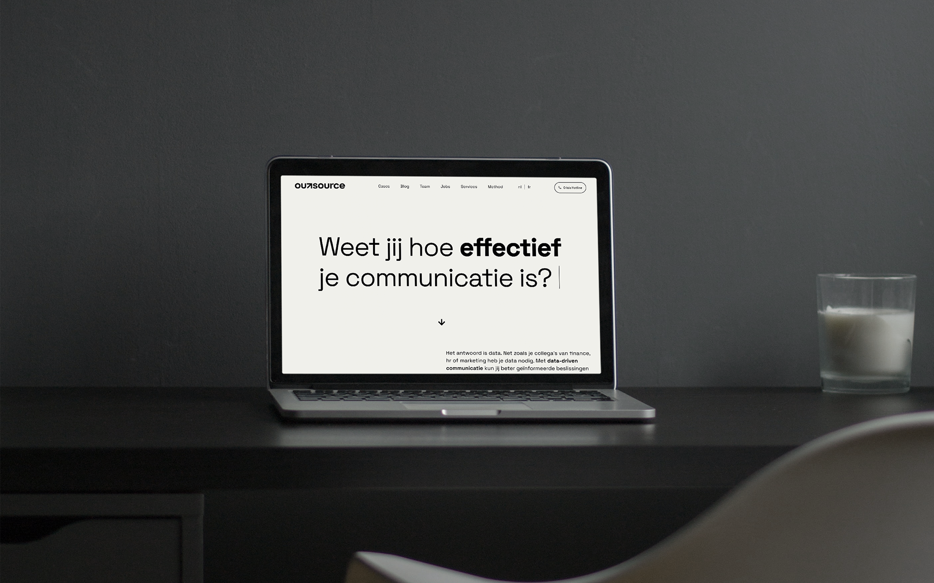
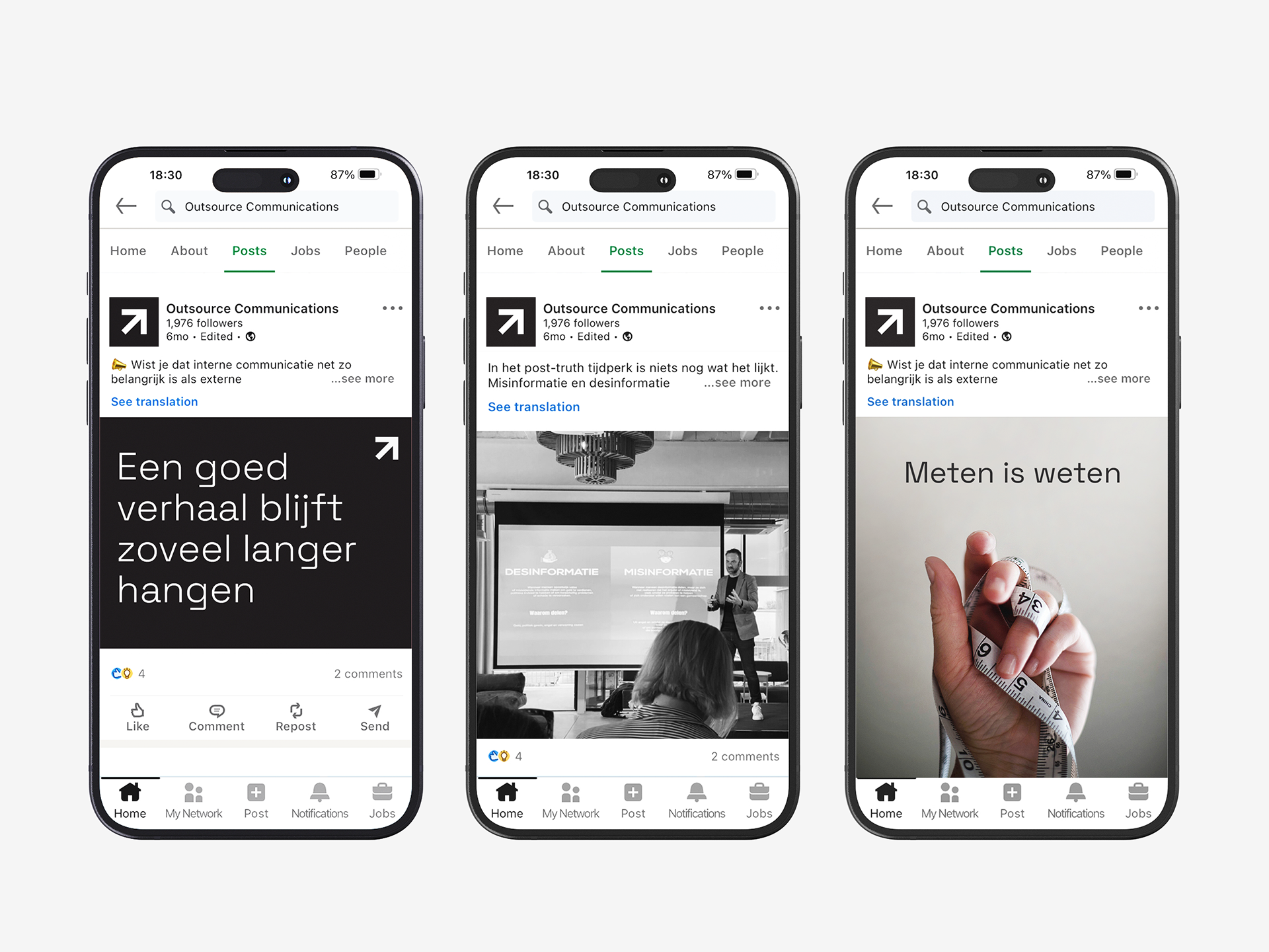
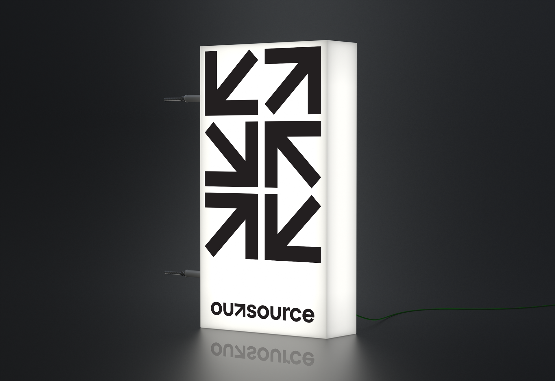
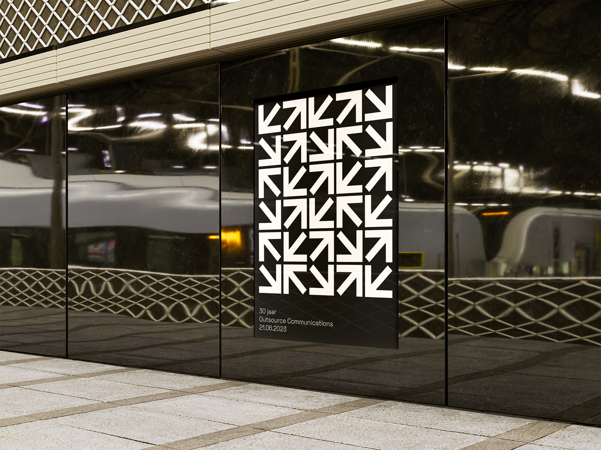
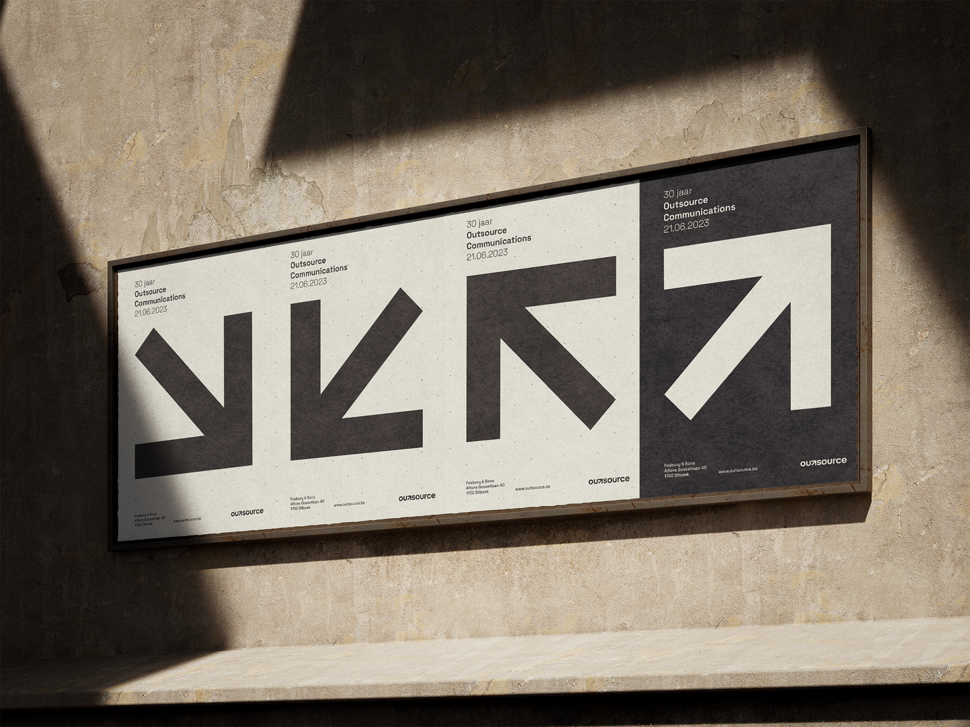
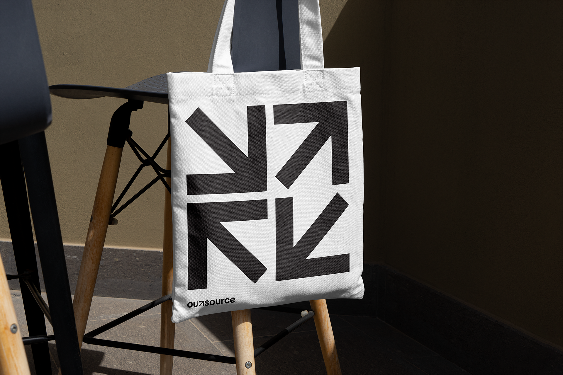
The old logo's vibrant colors gave way to a more subdued palette, complemented by a robust wordmark that better communicates the data-driven approach. The revitalized brand aligns with the company's dedication to knowledge-backed strategies, positioning it for the future. Seamlessly integrated into the wordmark, the arrow symbolizes guidance and forward-thinking, embodying the essence of Outsource in a simple, easily memorable and recognizable icon. This arrow becomes the cornerstone of an identity system centered around its symbolism.